Understanding Dark Mode in macOS 10.14 Mojave
The feature Apple is promoting most heavily with macOS 10.14 Mojave is Dark mode, which the company advertises as “a dramatic new look that helps you focus on your work… as toolbars and menus recede into the background.” Let’s look at what Apple has done with Dark mode, after which you’ll have a better idea of what to think about while trying it.
Enable Dark Mode
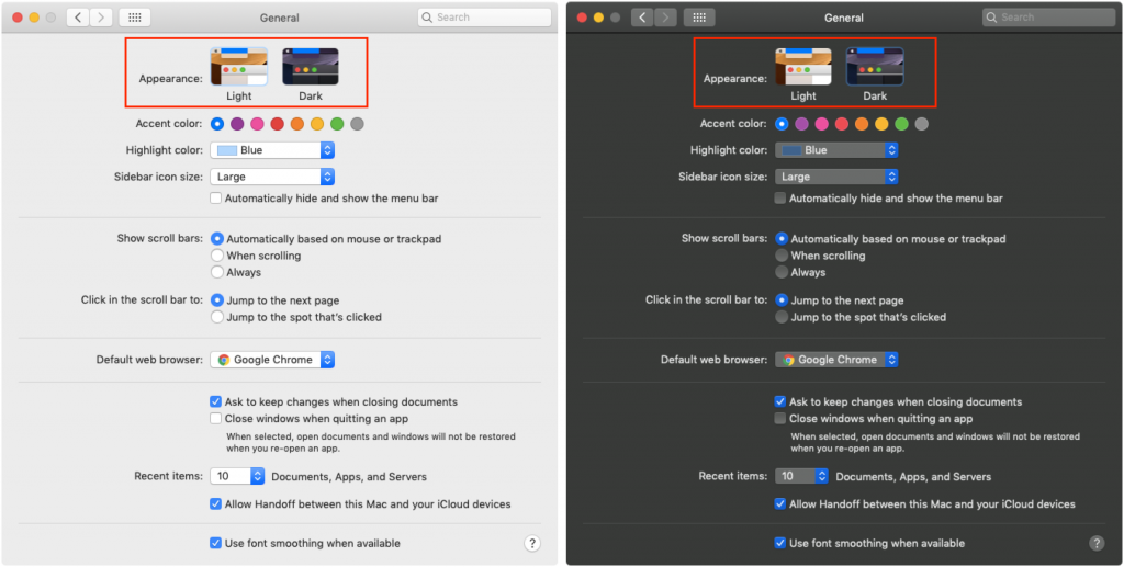
First, to turn Dark mode on, go to System Preferences > General and click the Dark thumbnail to the right of Appearance. Mojave immediately switches to Dark mode, turning light backgrounds dark and swapping the text color from dark to light.

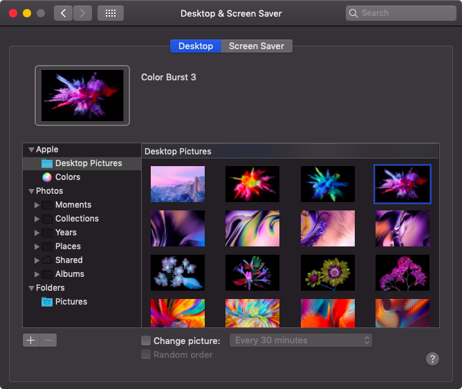
While you’re in System Preferences, click over to the Desktop & Screen Saver preference pane. If you scroll down in the Desktop Pictures list, you’ll discover a bunch of new wallpapers that blend well with Dark mode.

Dark Mode Support and Controls
You’ll notice that the color change takes place instantly not just in the Finder, but also in any apps that support Dark mode. Most of Apple’s apps support Dark mode and third-party developers are rapidly adding support to their apps as well. However, Dark mode requires explicit support from apps, so older apps that aren’t being updated will maintain their standard dark-on-light color schemes.
Some apps, such as Maps and Mail, give you additional options that change just how dark they get. In Maps, choose View > Use Dark Map to toggle between a dark map style and the familiar map style that mimics a paper map. Similarly, in Mail, go to Mail > Preferences > Viewing and deselect “Use dark backgrounds for messages” to return to a white background.

If you generally like Dark mode but have trouble reading light text on a dark background due to the reduced contrast, you may be able to choose a different font or style in the app’s preferences that makes the text more readable. Apps like Mail give you a fair amount of that sort of control.
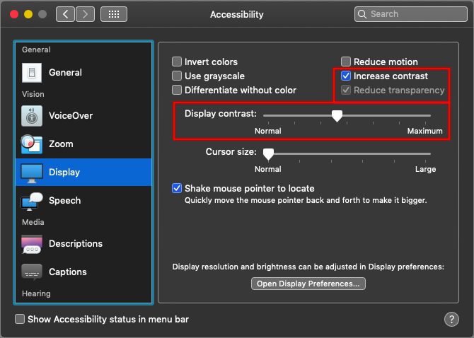
For even more control over contrast, open System Preferences > Accessibility > Display. There you’ll find a Display Contrast slider that lets you make text lighter and backgrounds darker. You can also select Reduce Transparency to make it so items like the Dock and menu bar are solid colors, rather than allowing the background to bleed through. To separate dark and light further, select Increase Contrast, which increases the brightness of divider lines as well.

The Dark Side of Dark Mode
Contrast is necessary for pulling out fine details, but too much contrast can be uncomfortable or even painful—think about how you feel when someone turns on a bright light in a previously dark room. For visual comfort, it’s usually best to match your screen with the lighting of your surroundings. That’s why people who often work at night or with the window blinds down like dark modes—a bright screen seems brighter in a dimly lit room. That’s the theory behind the traditional dark text on a light background too, since the room will be quite light during the day.
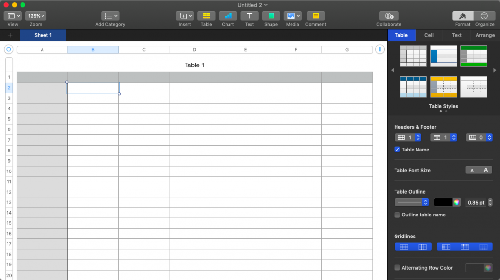
So Dark mode can run into two problems. First is that using it during the day or in a brightly lit room may create an uncomfortable contrast between the screen and its surroundings. Controlling your room lighting can eliminate this as an issue. Second and more troubling, even apps that support Dark mode may have large content areas that are bright white, creating a strong contrast between the content area and the rest of the app. Many Web sites in Safari have this effect, as do documents in apps like Pages and Numbers. There’s no way around this scenario.

Even if Dark mode isn’t perfect, it’s worth a try if you have trouble looking at bright screens. Regardless, if it goes too far for you, one of the new dark wallpapers may be easier on your eyes. While most people aren’t overly light sensitive, a non-trivial percentage of the population is, particularly those who suffer from migraines or who have endured concussions, and those with a variety of ocular conditions. And if you’re on the other end of the spectrum—if Dark mode looks dirty and is hard to read—just stick with the traditional Light mode.
Social Media: Apple is promoting macOS 10.14 Mojave’s new Dark mode heavily. Read on to learn if it might be for you, how you can tweak its contrast settings, and what problems you might encounter.


