Slow Mac? Here’s How to Figure Out If You Need More RAM
No matter how fast your Mac was when it was new, the time will come when apps launch slowly, the spinning beachball appears more often, and everything responds sluggishly. Such problems won’t happen all the time, and you can often fix them by quitting a piggy app or restarting your Mac. But if these problems are happening more frequently, one possible fix is to install more RAM. Also known as random-access memory, RAM is the temporary working space where macOS loads apps and documents while you’re using them. Let’s look at how memory is used, how you can determine if you need more, and what to do about it.
(To make sure we’re all on the same page, RAM and memory are two terms for the same thing, and are distinct from disk space or storage, where files are stored permanently even when your Mac is turned off. RAM is faster than a hard disk or SSD, but it’s much more expensive and is wiped clean when you restart or shut down your Mac.)
What Is RAM Used For?
When you launch an app, its code is loaded from disk into RAM for execution. Similarly, when you open a document, the app reads its contents into memory in order to manipulate the data quickly. macOS also uses significant quantities of RAM, and it relies on numerous helper apps.
It’s thus easy for macOS, its helper apps, and the apps you run to request more RAM than is actually installed in your Mac. Luckily, that’s not a show-stopper, thanks to memory compression and virtual memory. As macOS starts to use up free memory, it looks for chunks of data in memory that are inactive, perhaps due to being used by an app that’s running, but only in the background. It then tasks an underutilized processor core to compress that data in memory in much the same way you can compress a file in the Finder with the File > Compress command. When the data is needed again, macOS expands it. This compression and expansion process uses some processor time, but not so much that you’d usually notice unless you’re running other CPU-intensive apps.
When memory compression isn’t enough, macOS resorts to virtual memory, which involves copying chunks of inactive data from RAM to disk-based swap files and back as needed, a process called paging. Virtual memory lets the Mac use more RAM than it has, but at the cost of speed, since copying to and from the drive is slow.
Checking Memory Usage
You’ll notice your Mac getting sluggish if you open too many apps or documents, but Apple has provided a better way to see what’s going on: the Activity Monitor app, which is stored in the Utilities folder in your Applications folder. Open Activity Monitor, and click the Memory button to see a list of apps, how much memory they’re using, and other details. Click the Memory column header to sort by the apps using the most memory. You can use this list to figure out which apps to quit first to recover memory.
The most useful part of Activity Monitor, however, is the Memory Pressure graph at the bottom. It shows green when there is plenty of memory available, yellow when macOS is compressing memory, and red when it has been forced to rely on virtual memory. The Mac shown below is very unhappy.
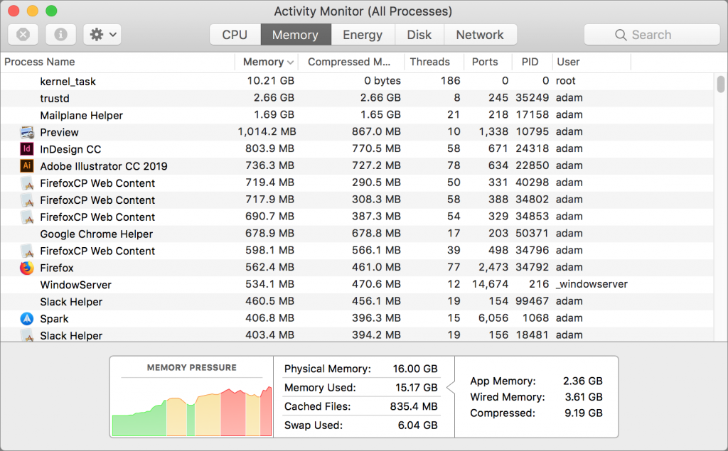
Whenever your Mac is feeling slow, to see if insufficient RAM is the culprit, look at the Memory Pressure graph. If you see a lot of yellow and any red, macOS’s memory management is hurting overall performance. The quick fix is to close unnecessary documents, Web browser tabs, and apps, but if you regularly see red in the Memory Pressure graph with the apps you need to get your work done, it’s time to think about acquiring more RAM.
Get More RAM… or a New Mac
It used to be relatively easy to add RAM to most Macs, but with today’s Macs, it’s often either difficult or impossible.
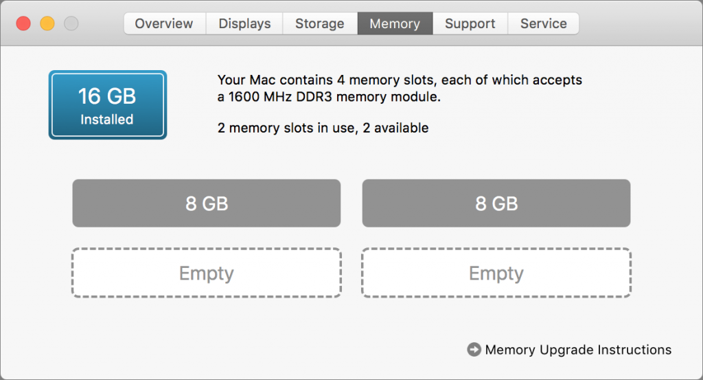
In general, you can add memory to the 27-inch iMac, the Mac mini, and the Mac Pro. It’s also possible for Apple Authorized Service Providers to add memory to the iMac Pro and most models of the 21.5-inch iMac. If you have one of these Macs, you can learn more about how much RAM you have and what you can install by choosing Apple > About This Mac > Memory or by consulting a guide on a RAM vendor’s Web site.
Unfortunately, there’s no way to upgrade the memory in a 12-inch MacBook, MacBook Air, or MacBook Pro (since the mid-2012 models). If you have one of these Macs and you need more RAM for reasonable performance, your only option is to buy a new Mac.
Feel free to get in touch with us if you need help choosing and installing RAM, or for advice on how much RAM to get in your next Mac. Generally speaking, 8 GB is now the least RAM you should consider, 16 GB is a reasonable amount for most people, and 32 GB or more may be necessary for resource-intensive tasks.