New Features You May Have Missed in the iOS 14.1, 14.2, and 14.3 Updates
We’ve published overviews of the major features in iOS 14 and iPadOS 14, along with detailed looks at our favorite features. But Apple keeps releasing updates with new features, and we wanted to take a moment to catch you up on what Apple has added in versions 14.1, 14.2, and 14.3. (If you’re running iOS 14 or iPadOS 14, you should update to the latest version, which is 14.3 as of this writing. There’s no benefit to staying at an interim version.)
Here’s what you may have missed.
Apple Fitness+
The highest-profile change in Apple’s recent updates is support for Apple Fitness+. It provides studio-style streamed video workouts that you can participate in using an iPhone, iPad, or Apple TV. The linchpin of the system is the Apple Watch, which tracks your fitness metrics and progress and stores them in the Fitness app (previously called Activity).

Apple Fitness+, which can be shared by up to six family members through Family Sharing, costs $9.99 per month or $79.99 per year. All current owners of an Apple Watch Series 3 or later get a free month to try it out, and if you buy a new Apple Watch, Apple will give you 3 months for free.
If you have an Apple Watch and more exercise figured in your New Year’s resolutions, give Apple Fitness+ a try and see if you find it fun and worthwhile.
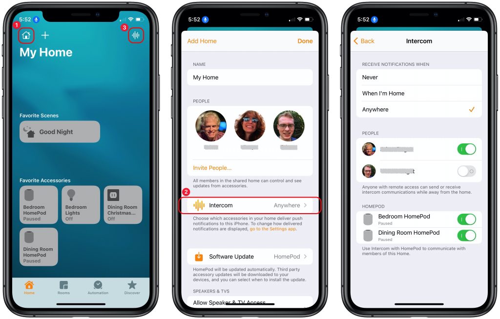
Intercom
Tired of yelling to get the attention of other members of your household? If you have two more HomePod speakers, you can use the new Intercom feature to send and receive messages through the HomePods. You can also send and receive messages through an iPhone, iPad, iPod touch, or Apple Watch, or in your car with CarPlay.
To enable Intercom, open the Home app, tap the house icon at the upper left ➊, and tap Home Settings. In the Settings screen, tap Intercom ➋ and set when you want to receive notifications, who should be allowed to send and receive them when away from home, and which HomePods to use.
Once you’ve enabled Intercom, you can most easily invoke it with Siri on any of your devices using trigger words like “intercom,” “tell,” “announce,” or “ask.” You can also send messages solely to a HomePod in a specific room or zone by specifying its name in the message. For example:
“Hey Siri, announce ‘It’s time to leave now!’”
“Hey Siri, ask upstairs ‘Did anyone feed the fish?’”
You can also access Intercom from within the Home app. Tap the waveform button in the upper-right corner of the screen (➌ above), record your message, and tap the Done button to send it.
When you hear an Intercom message, you can reply. If the message went to the entire Home, your reply will as well. However, if the message was sent to your specific room, your response will go only to the device that sent the message. And you can always direct a reply to a particular speaker. For example:
“Hey Siri, reply ‘I’m almost ready to go, honest!’”
“Hey Siri, reply downstairs ‘Yes, I fed Goldie.’”
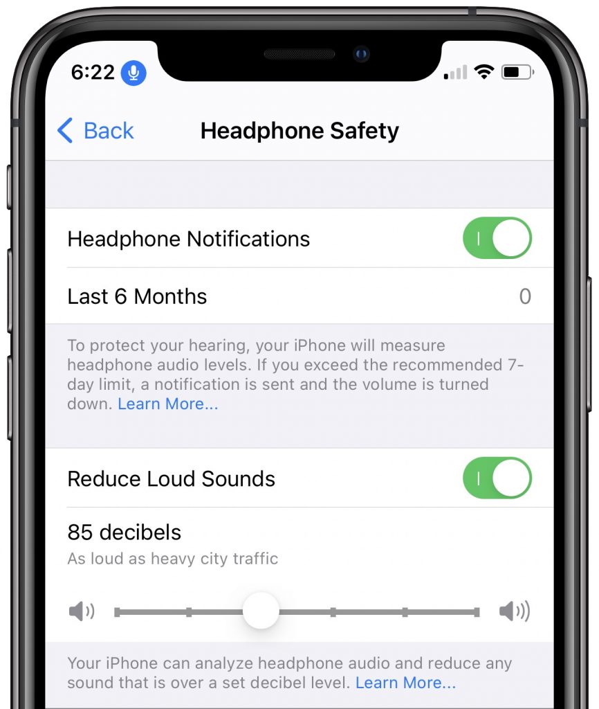
Loud Headphone Alerts
If you’re worried about damaging your hearing with too-loud headphone volumes (and you should be), go to Settings > Sounds & Haptics > Headphone Safety. There you can enable a notification that will tell you if you exceed the recommended limit for noise exposure (volume and time) as set by the World Health Organization.
That’s nice from a retrospective point of view, but more useful are the controls below, which let your iPhone actively protect your hearing by reducing the volume of sounds over a certain decibel level.
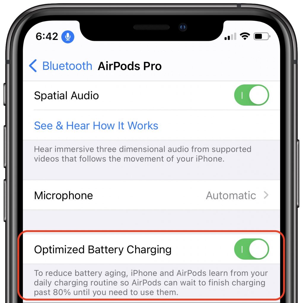
Optimized AirPods Pro Charging
Apple says that it has now tweaked AirPods Pro charging to increase the lifespan of the battery. It does this by delaying charging past 80% to reduce the amount of time the batteries stay fully charged. Apple previously did this with the iPhone and Apple Watch. Given that there’s no way to replace the battery in the AirPods Pro, anything that extends their useful life is welcome. Sadly, this feature isn’t available for the standard AirPods. If you find that the feature regularly prevents your AirPods Pro from having a full charge, you can turn it off in Settings > Bluetooth (make sure the AirPods Pro case is open or they’re in your ears). Tap the i button next to your AirPods Pro and turn off Optimized Battery Charging.
Launch Shortcuts on the Home Screen Directly
In iOS 14, the Shortcuts app lets users assign custom icons to shortcuts, which has led some to become obsessed with customizing their Home screens with shortcuts that launch their favorite apps. Dedicated designers have created all sorts of Home screen looks, ranging from the minimalist to the wacky. The only problem was that these shortcuts first launched the Shortcuts app and then switched to the desired destination app. As of iOS 14.3, shortcuts now launch directly from the Home screen without passing through the Shortcuts app.
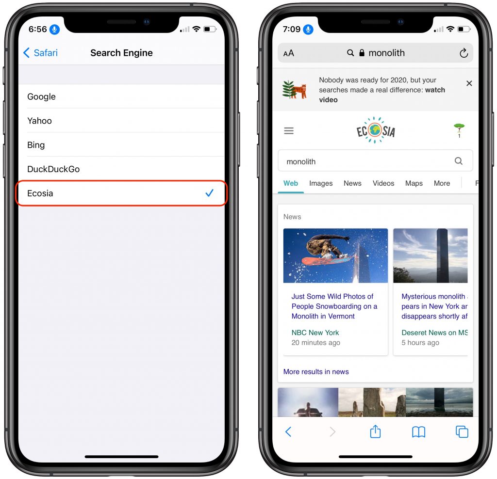
Use Ecosia as Safari’s Default Search Engine
Want to move away from Google as your default search engine? iOS has long provided other options, including Yahoo, Microsoft’s Bing, and the privacy-focused DuckDuckGo. Apple has now added Ecosia, which is privacy-friendly and donates 80% or more of its profits to non-profit organizations that focus on reforestation. It’s a small way you can help fight climate change. It’s worth keeping in mind that Yahoo is a rebadged version of Bing, DuckDuckGo relies heavily on Bing, and Ecosia delivers results from Bing, enhanced by its own algorithms. In other words, when it comes to the quality of the search results, your choices are really between Google and Bing.
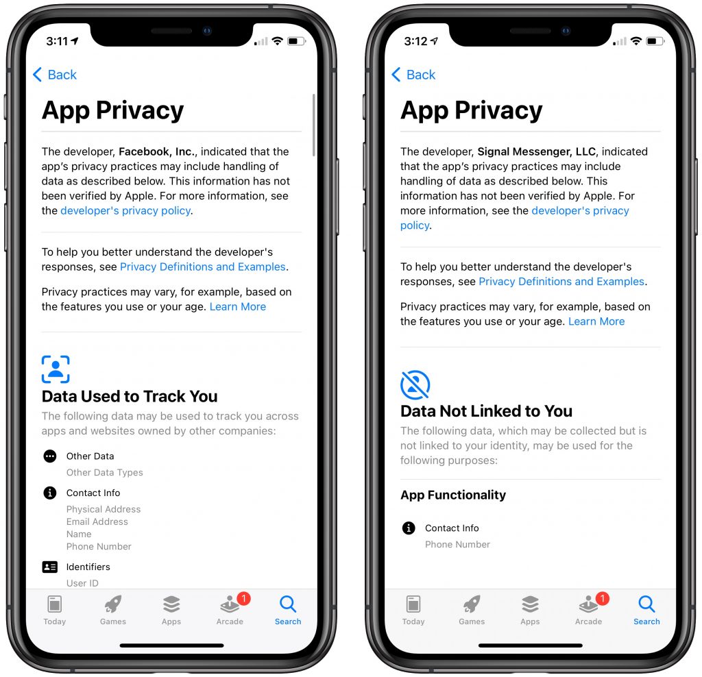
New Privacy Labels in the App Store
In Apple’s latest salvo against privacy-abusing apps and services, the company now requires all developers to provide information in App Store listings about what data collected by the app is linked to you personally and what data will be used to track your online movements. Apple doesn’t verify the information, and there’s no way to know if the developer is being truthful. Nonetheless, it’s good to see Apple pushing developers to be more transparent about their privacy practices. In the screenshot below, compare the ten screens of App Privacy details for what Facebook hoovers up with what is collected by the privacy-focused messaging app Signal: just your phone number, which is necessary for others to contact you.
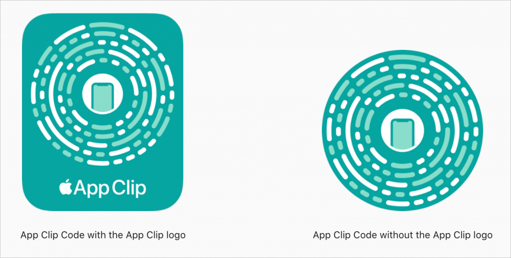
App Clip Codes
In non-pandemic times, the new App Clips feature of iOS 14 might have gotten more attention. App Clips are lightweight versions of an app that let people perform quick tasks—ordering a latte, renting a scooter—without downloading and configuring the full app. Apple encourages developers using App Clips to advertise their presence with App Clip Codes, which look a little like QR codes but are dedicated to launching App Clips. Now that iOS 14.3 has added support for App Clip Codes, if you notice one while you’re out and about, try scanning it with your camera to see what App Clip pops up.
iOS 14’s updates have added plenty of smaller features as well, such as over 100 new emojis, an Apple TV+ tab in the Apple TV app, additional data options in the Health app’s Cycle Tracking feature, air quality data and recommendations in more countries, and detection of people in Magnifier (which is helpful for users who are blind or who have low vision).
So if you have kept your iPhone or iPad up to date but haven’t noticed these new features, give them a try!
(Featured image based on an original Web page by Apple)