In Case of Emergency, Create an iPhone Medical ID

Accidents, particularly those involving automobiles, are all too common, and while no one plans to be in one, you can prepare for the eventuality. If you end up in a state where you can’t speak with emergency responders or are too shaken up to share your details clearly, your iPhone can provide them with essential medical information. Emergency responders are trained to know how to access these details.

Apple makes this possible via the Medical ID feature of the Health app, which you can use to record medical data and emergency contact information (this is sometimes referred to as “ICE information,” where ICE stands for “In Case of Emergency”). Once you’ve entered all this information, emergency responders can use your iPhone to learn about your medication allergies and other conditions, plus contact your family. This data could also help a Good Samaritan return a lost iPhone. (Unfortunately, the Health app isn’t available on the iPad.)

To set up or edit your Medical ID, follow these steps (in iOS 13; they’re slightly different in earlier versions of iOS):

  1. Open the Health app and tap the Summary tab at the bottom.
  2. Tap your profile picture in the upper-right corner.
  3. Under Medical Details, tap Medical ID.
  4. Tap Edit in the upper-right corner.
  5. Make sure the Show When Locked switch is on.
  6. Enter all the relevant details about your medical conditions, medications, allergies, and so on.
  7. Specify one or more emergency contacts. These must be people in the Contacts app with phone numbers; if the right people aren’t there, add them first. You can’t select your own card in Contacts, so consider making one for a fake person called “If Lost, Please Call” and listing a different phone number at which you can be reached.
  8. Tap Done.


Hopefully, you’ll never have to use someone else’s Medical ID information, but you should know how to do so. You should also teach family, friends, and colleagues how to find and use this information. Should you come across a bicyclist who has had a bad crash or a similar situation, follow these steps:

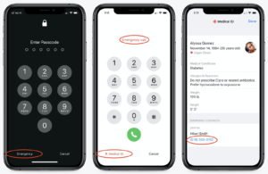
  1. With a locked iPhone that uses Touch ID, press the Home button to display the Passcode screen. For iPhones with Face ID, press the side button and swipe up from the bottom.
  2. On the Passcode screen, tap Emergency in the bottom-left corner to move to the Emergency screen. If needed, call 911 from this screen by tapping Emergency Call.
  3. Again at the bottom left, tap Medical ID to display the Medical ID screen, complete with all the details that person entered into the Health app.
  4. From that screen, you can share the information with EMTs or other first responders so they’re aware of any serious conditions or allergies that would affect treatment. You can also call any emergency contacts listed by tapping their numbers.


Please, enter your medical and emergency contact details into the Health app right now, and spread the word to everyone you know. It could save your life, or help you save someone else’s!

(Featured image by F. Muhammad from Pixabay)

Apple Releases Redesigned Mac Pro and Pro Display XDR

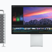
We’re not going to beat around the bush. Apple’s new Mac Pro and Pro Display XDR redefine what “pro” means. If you aren’t certain that the fastest and most powerful Mac and an expertly calibrated 6K Retina display will enable you to make more money immediately, they’re probably not for you. You should also be ready to spend at least $12,000—and likely several thousand more—on the combination. For that money, though, you’ll get a system that puts every previous Mac setup to shame.

Mac Pro

The new Mac Pro, which Apple first teased in April 2017 and formally announced over two years later in June 2019, is the result of a complete reimagining of what a Mac for pro users should offer. In contrast with the previous cylindrical design, which favored form over function, Apple consulted with numerous pro users on the design and specs of the new Mac Pro tower.

Physically, the Mac Pro utilizes a stainless steel frame that provides mounting points for a wide array of components and configurations. An aluminum housing slips off to provide 360-degree access, with the processor, graphics, and expansion slots on one side, and storage and memory on the other. One size does not fit all pro users, so you’ll be able to customize the Mac Pro to your needs. Finally, optional wheels make it easy to move the Mac Pro around a set, stage, or studio.
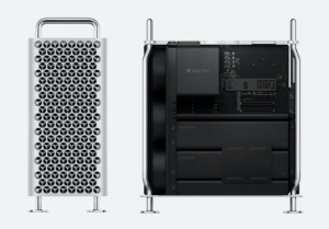
 

For the ultimate in performance, the Mac Pro relies on an Intel Xeon W processor, and you can choose from 8, 12, 16,  24, or 28 cores. Base clock speeds vary with the number of cores, but all except the 8-core model support Turbo Boost to 4.4 GHz (the 8-core model only spikes to 4.0 GHz). Similarly, the 8-core model operates memory at 2666 MHz, whereas the remaining models run memory at 2933 MHz for increased performance. With the high-end 28-core configuration, Apple is promoting performance increases over the previous 12-core Mac Pro of 300% to 500% for activities like Photoshop filters, Xcode builds, Logic Pro plug-ins, and Autodesk Maya rendering.

Speaking of RAM, the base level is 32 GB, but there are 12 DIMM slots, so you can upgrade to 48 GB, 96 GB, 192 GB, 384 GB, 768 GB, or a whopping 1.5 TB. That final RAM ceiling is available only with the 24- and 28-core models.


These days, much of a workstation’s performance comes from its dedicated GPUs, which are essential for 3D animation, 8K video compositing, and building lifelike gaming environments, along with pure number crunching. Apple integrates GPUs via the new Mac Pro Expansion Module, or MPX Module, and the Mac Pro holds two MPX Modules. Those modules come with an AMD Radeon Pro 580X, Radeon Pro Vega II, or Radeon Pro Vega II Duo, the last of which combines two Vega II GPUs in a single module. For maximum compute power, configure two MPX Modules with Radeon Pro Vega II Duos for four GPUs. Those cards also offer a variety of DisplayPort, Thunderbolt 3, and HDMI 2.0 ports for connecting displays.

Of course, any Mac aimed at pros needs to be expandable, and the Mac Pro offers eight PCI Express expansion slots: four double-wide slots, three single-wide slots, and one half-length slot preconfigured with an Apple I/O card. Apple also offers the Afterburner PCI Express card, which accelerates ProRes and ProRes RAW codecs in Final Cut Pro X, QuickTime Player X, and supported third-party apps.

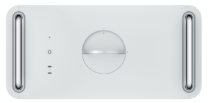
That Apple I/O card provides two USB 3 ports using the USB-A connector, two Thunderbolt 3 ports, and two 10-gigabit Ethernet ports. The top of the Mac Pro case (shown below) provides another two Thunderbolt 3 ports. Of course, 802.11ac Wi-Fi and Bluetooth 5.0 are built in.
 

In terms of storage, the Mac Pro starts with a 256 GB SSD for those whose data is all stored externally. However, you can also upgrade to 1, 2, or 4 TB SSDs, and Apple’s T2 security chip automatically encrypts all onboard storage.

All this computing power requires lots of electrical power, so Apple has outfitted the Mac Pro with a 1.4-kilowatt power supply. It will generate a lot of heat as well, so the design facilitates thermal cooling, with heat pipes directing hot air away from the CPU and dispersing it along aluminum fin stacks. Three impeller fans keep cool air moving across the CPU and GPUs, while a blower on the other side pulls air across the memory, storage, and power supply.

Pro Display XDR

If you’re a high-end software developer or audio pro, you may not care that much about your monitor. But if you spend your days working with video or graphics, you may want to consider Apple’s new Pro Display XDR to accompany your Mac Pro. It starts at $4999.

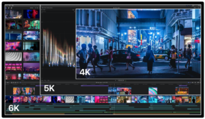
For starters, the Pro Display XDR is a 6K Retina display, which provides nearly 40% more screen real estate than a 5K display. It runs at 6016-by-3384 pixels at 218 pixels per inch. For those working with 4K video, that means you can see your video and have room for your tools, all on one screen.
 

It’s also likely the best-looking display you’ve ever used. It features 1000 nits of sustained brightness, and peaks at 1600 nits—most typical desktop monitors provide only 350 nits of brightness. That results in a 1,000,000:1 contrast ratio. It also provides a P3 wide color gamut and true 10-bit color, enabling it to produce more than 1 billion colors accurately.

The Pro Display XDR offers reference modes that enable you to match its output—color space, white point, gamma, and brightness—to the requirements for HDR, HD, SD video, and digital cinema, not to mention general photography, design, and print. You can even create custom reference modes.

Most displays suffer if you’re not looking straight at them, but with new polarizing technology, the Pro Display XDR boasts a wide viewing angle that provides up to 25 times better off-axis contrast than a typical LCD screen. Apple also engineered it for low reflectivity, and for the ultimate in matte screens, you can pay $1000 more for nano-texture glass that cuts reflections even further.

Not surprisingly, the Pro Display XDR is a hefty unit. It’s 23.8 inches (71.8 cm) wide, 16.2 inches (41.2 cm) high, and 1.1 (2.7 cm) inches deep, and it tips the scales at 16.5 pounds (7.5 kg). On the back, you’ll find one Thunderbolt 3 port and three USB-C ports.
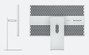
 

What you won’t get with the Pro Display XDR out of the box is a stand. You can choose between Apple’s Pro Stand for $999 or the $199 VESA Mount Adapter, which lets you put the Pro Display XDR on an arm attached to a desk or wall. The beefy Pro Stand, which weighs in at 9.5 pounds (4.3 kg), offers a total height adjustment of 12 cm and can tilt from -5º to +25º. When using the Pro Stand, you can also rotate the Pro Display XDR from landscape to portrait to choose the orientation that you prefer.

Configure Carefully

As you can tell, the Mac Pro and Pro Display XDR provide a vast array of options, and at the prices Apple is charging, you want to make sure you’re getting the configuration that best fits your needs and budget. So before you order, get in touch with us to talk through what options you’re most likely to need.

(Images by Apple)

Do You Put Dates in Filenames? Use This Format for Best Sorting

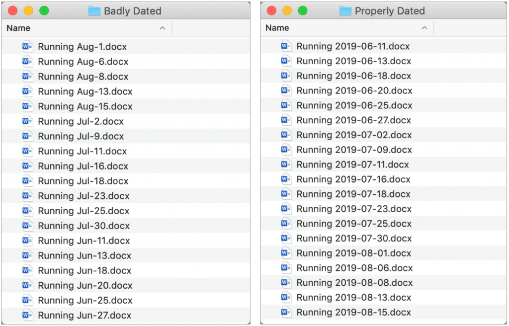
There are plenty of situations where it makes sense to put a date in a filename, but if you don’t use the right date format, the files may sort in unhelpful ways. For instance, using the names of months is a bad idea, since they’ll sort alphabetically, putting April before January. And although the Mac’s Finder is smart enough to sort filename-3 before filename-20, most other operating systems are not (because 2 comes before 3). So, to make your life—and the lives of everyone with whom you share files—a little easier, use this date format, which is guaranteed to sort correctly everywhere: YYYY-MM-DD. That translates to a four-digit year, followed by a two-digit month (with a leading zero if necessary), and a two-digit day (again, with a leading zero if need be).

(Featured image by Henry & Co. on Unsplash)

Which Precise Mac Model Do You Have? Here’s How to Find Out

Apple likes to keep Mac names simple, but that’s not always helpful. For instance, if you want to add RAM to your Mac, it’s not good enough to know that it’s an iMac. You’ll need to know that it’s a 27-inch iMac with Retina display from late 2014. To find that out, choose About This Mac from the Apple menu. In some cases, you might even need to know the model identifier, which is a numeric code that’s accessible if you click the System Report button in the About This Mac window, and then click Hardware at the top left of the System Information window. It will be something like iMac15,1.

(Featured image modified from an original by Startup Stock Photos from Pexels)

iOS 13 Makes Editing Text Easier

Let’s be honest—text editing in iOS has never been anywhere near as good as it is on the Mac. We may be more accustomed to our mice and keyboards, but the Multi-Touch interface has always been clumsy when it comes to text. Apple keeps trying to improve iOS’s text editing features, and iOS 13 (and iPadOS 13) brings some welcome changes in how we go about positioning the text insertion point, selecting text, and performing the familiar options in the Mac’s Edit menu: Cut, Copy, Paste, and Undo/Redo. Has it caught up with the Mac yet? You’ll have to decide that for yourself, once you’ve learned the new techniques.

Note that these changes apply only to spots in iOS where you’re entering and editing text, not selecting and copying static, read-only text such as a Web page in Safari. And even when you are working on a Web page where you can enter and edit text, the site may override iOS’s text handling.

Insertion Point Positioning

Positioning the insertion point on the Mac is easy—you move the cursor to the right spot and click. In previous versions of iOS, you could tap to put the insertion point at the start or end of a word, or press and hold briefly to bring up a magnifying glass that let you put the insertion point anywhere, including within a word. It was slow and awkward, and made better mostly by trackpad mode, which you could invoke by long-pressing the Space bar.

iOS 13 improves positioning by letting you press and hold the insertion point to pick it up and then drag it to where you want it. This approach is much easier and more sensible than the previous method.

Selecting Text

On the Mac, you can select text with multiple clicks, by clicking and dragging, or by using the keyboard. In iOS, however, text selection has always been tough—you could double-tap to select a word, but anything else required subsequent moving of start and end markers. (On an iPad with a keyboard, you could hold Shift and use the arrow keys too.)

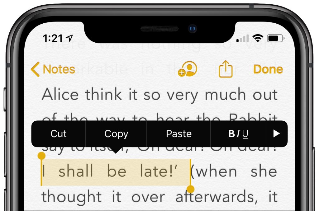
Happily, iOS 13 improves text selection. To start, you can still double-tap to select a word, but you can also triple-tap to select a sentence (shown below) and even tap four times in quick succession to select an entire paragraph. Unfortunately, these selection shortcuts may not work in all apps, but you can always fall back on the previous approach.

For selections of an arbitrary length, just press, pause ever so briefly to start selecting, and then drag to extend the selection. In other words, it’s as close to the Mac approach as is possible with the Multi-Touch interface. If the selection isn’t quite right, you can adjust the start and end markers.

Cut, Copy, Paste, and Undo Gestures

Everyone knows Command-X for Cut, Command-C for Copy, Command-V for Paste, and Command-Z for Undo on the Mac. In previous versions of iOS, those commands were available only from a popover that appeared when text was selected, or (for Paste) when you pressed and held in a text area. The only command with a gesture, so to speak, was Undo. At the risk of dropping it, you could shake your iOS device to undo your last action. Not good.

iOS 13 introduces a variety of three-finger gestures to make these commands quick and easy to invoke. Note that you can use the entire screen for these gestures—it’s OK to make them with one finger over the keyboard.

  • Copy: To copy selected text, pinch in with three fingers, or, more likely, your thumb, index finger, and middle finger.
  • Cut: To cut (copy and then delete) selected text, perform the copy gesture twice in quick succession.
  • Paste: To paste the text you’ve copied at the insertion point, reverse the action—pinching out (spreading) with three fingers.
  • Undo: To undo a mistake, immediately swipe left or tap twice with three fingers. You can keep swiping or double-tapping to undo more actions.
  • Redo: To redo the action that you just undid, swipe right with three fingers.

Whenever you use one of these gestures, a little feedback badge appears at the top of the screen to reinforce what you just did.

If you can’t remember which direction to pinch or swipe, press and hold with three fingers anywhere for a second to see a shortcut bar at the top of the screen with icons for Undo, Cut, Copy, Paste, and Redo.

Finally, instead of using Cut and Paste to move a swath of selected text, try dragging it to the new position.

Slide to Type

Various third-party keyboards have provided “slide-to-type” over the years, letting you type a word by sliding your finger from letter to letter on the keyboard without lifting it up in between. But switching to a third-party keyboard meant that you often gave up useful other features, like Siri dictation, so most people stuck with Apple’s default keyboard.

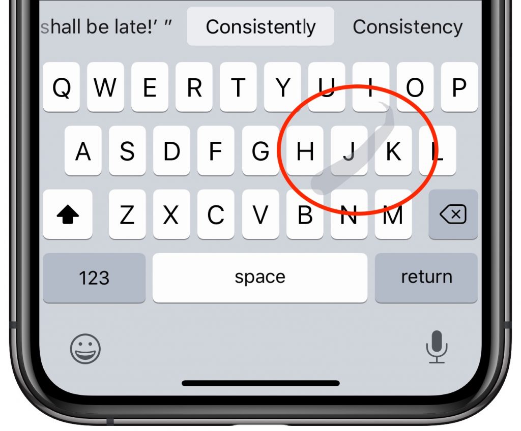
On the iPhone, iOS 13 now lets you slide to type on its default keyboard, and it works surprisingly well. In iPadOS 13, slide-to-type works only on the new floating keyboard you can get by pinching with two fingers on the default keyboard (pinch out with two fingers to restore the default keyboard). When you get to the end of a word, lift your finger to insert it, and then start sliding again for the next word. If you make a mistake, the suggestions above the keyboard often provide the word you want. You can switch between tapping (best for unusual words) and sliding on a word-by-word basis.

Make a mistake with sliding? By default, tap Delete after inserting a slide-to-type word to delete the whole word, not just the final letter. If you don’t like that behavior, turn off Delete Slide-to-Type by Word in Settings > General > Keyboard.

(Featured image by Lorenzo Cafaro from Pixabay)