Use iOS 17’s Check In Feature to Reduce Worry

We’ve all had a friend or family member say, “Text me when you get home,” because they want the peace of mind from knowing you arrived safely. But what if something goes wrong—or you forget—so they never receive that text? They’ll be worried and won’t know where you are, if you’re OK, and so on.

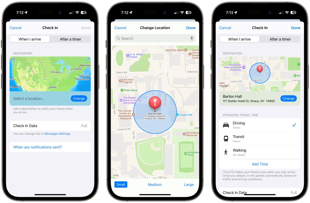
In iOS 17, Apple has introduced the Check In feature to provide peace of mind—or in the worst case, to help emergency services. It’s conceptually simple. Before you leave to go somewhere, you create a Check In with someone—call them a safety partner—in Messages. You specify where you’re going and whether you’re driving, taking transit, or walking. Then, when you arrive, the Check In automatically ends, alerting your safety partner that you arrived. If you’re delayed en route, Check In takes that into account and extends the expected arrival time appropriately. If you fail to arrive, Check In shares your location and route with your safety partner. Also, if you make an Emergency SOS call or your iPhone or Apple Watch calls emergency services automatically during the Check In, it notifies your safety partner.
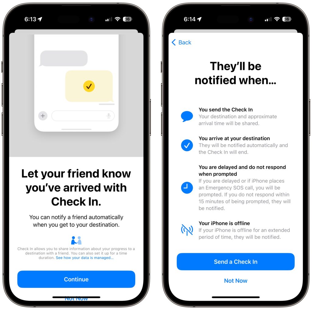
Not all situations revolve around following a specific route to a location, so Check In also supports timers. Perhaps a college student is going for an hour-long trail run and wants a friend to check on her if she’s not back as expected. She can use Check In to set a timer for 1 hour, share it with her friend, and when the timer ends, either tap the End button if she’s back or add more time if the run is going fine but taking longer than expected.

Although Check In may seem targeted at friends and family, it could have business uses as well. For instance, a destination Check In might work well for keeping tabs on a colleague traveling to a make-or-break pitch presentation.

Before you start using Check In with someone—in either direction—explain Check In to them and discuss an appropriate response if you or they fail to end Check In successfully. Responses should probably start with a quick text, followed by a phone call. If initial efforts to reach out are met with silence, contacting other people—friends, family members, neighbors, etc.—may be appropriate. At some point, depending on various factors, it will be time to call law enforcement. Of course, if the other person triggers an Emergency SOS during the Check In, call law enforcement immediately. At least in the US, if the person isn’t in your area, don’t call 911. Instead, find the law enforcement website for where the person is and call that organization’s 10-digit number. And here’s hoping it never comes to that!

Create a Check In

To get started with Check In, follow these steps:

  1. In Messages, open a conversation with the person you want to be your safety partner (Check In doesn’t currently work with group conversations).
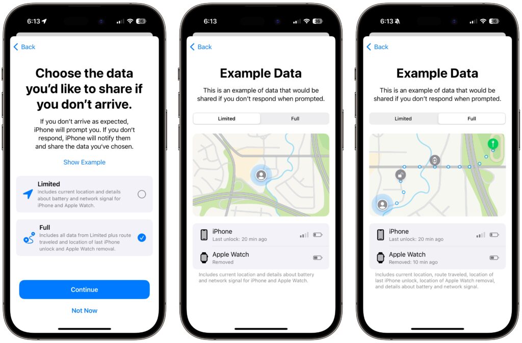
  2. Tap the ⊕ button to the left of the message field, tap More at the bottom, and tap Check In.
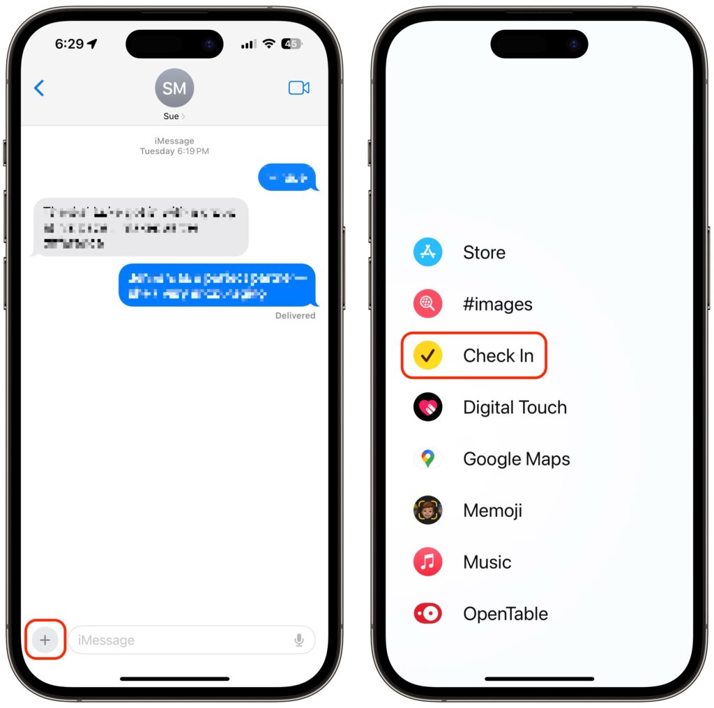
  3. The first time you invoke Check In, Messages walks you through a series of explanatory screens, one of which is important—the privacy level of the data shared with your safety partner if you don’t arrive. Select Full—we can see almost no reason why you wouldn’t want that person to be able to share your exact location and route with emergency services if something has gone wrong. (If necessary, tweak this setting later in Settings > Messages > Data.)
  4. On subsequent uses of Check In, an unsent card appears in the Messages conversation, usually set for an hour in the future. The card isn’t sent automatically so you can customize it before sending it.
  5. Tap the Edit button to adjust the timer or destination.
  6. To change the timer duration, use the time picker and tap Done. Skip to the last step in this list.
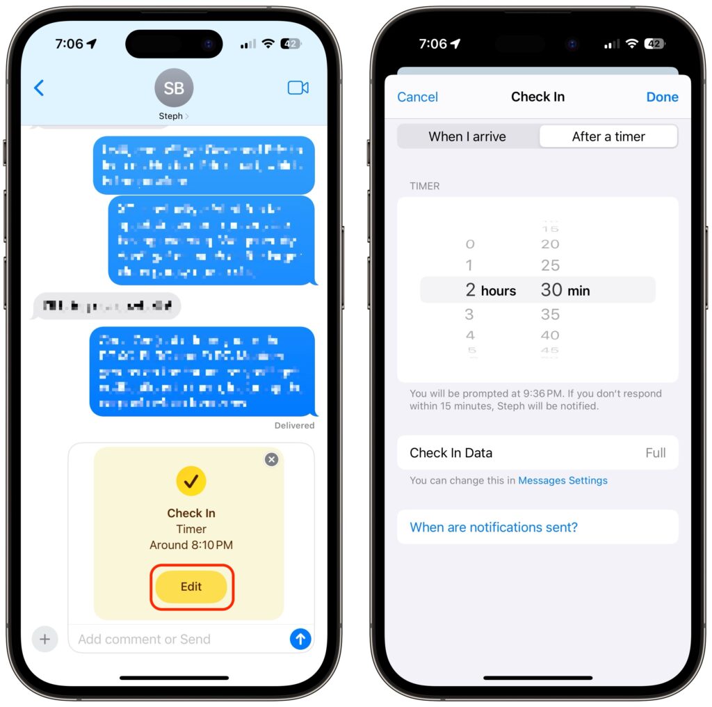
  7. To set a destination instead of a timer, tap “When I arrive” at the top of the screen.
  8. Tap the Change button, and in the map, either search for a location or find one manually by pinching and zooming—touch and hold the map to drop a destination pin. At the bottom of the screen, select Small, Medium, or Large to set the size of the area in which you’ll arrive.
  9. Tap Done to close the map and then select Driving, Transit, or Walking so Check In can estimate your arrival time based on your method of transportation.
  10. If you want additional buffer time, tap Add Time and give yourself 15, 30, or 60 minutes beyond when Check In thinks you’ll arrive. This shouldn’t usually be necessary.
  11. Tap Done.
  12. Once you’re back to the Check In card in the Messages conversation, tap the Send button to start the Check In.

Note that safety partners can’t reject Check In cards.

End a Check In

Once you trigger a Check In, it can end in a few ways. First, you can cancel it before the timer completes or you arrive at your destination. Second, it can end successfully when you tap End when the timer finishes or when you arrive at your specified location. Third and finally, there’s the core purpose of the Check In, which is to alert your safety partner if you fail to respond to a timer or arrive where and when you said you would.

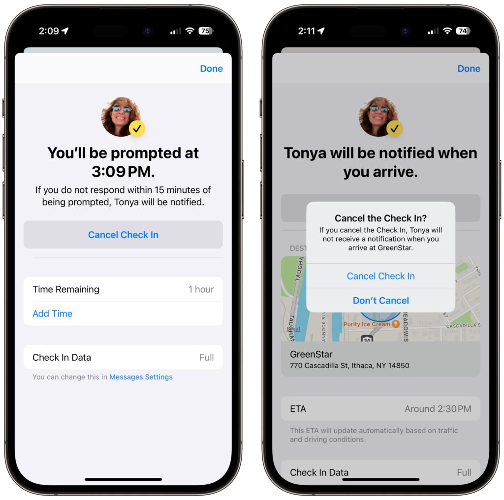
  • Cancel: To cancel a Check In, tap the Details button on the Check In card in Messages, tap Cancel Check In, and agree that you don’t want your safety partner notified. Timer and destination Check Ins look slightly different but act the same way. Your safety partner will only see that the Check In card in Messages says it has ended.
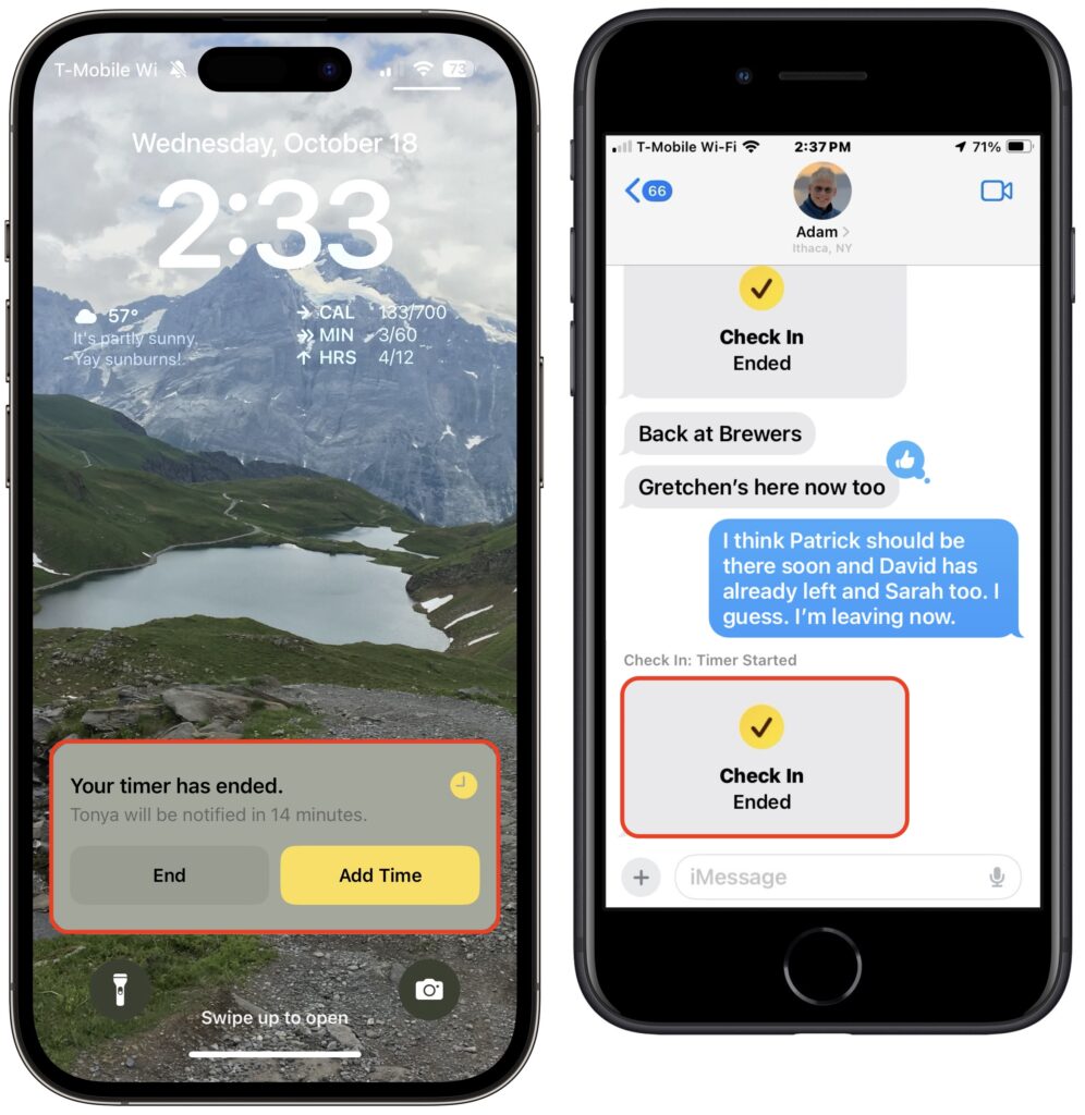
  • End successfully: For a timer Check In to end successfully, you must respond when the iPhone prompts you (below left). All your safety partner sees when that happens is a note in the Check In card that the timer ended (below right). You don’t need to interact with your iPhone for a destination Check In to end successfully—just arrive at the specified location. The safety partner’s Check In card updates to say that you arrived.
  • Check In fails to end (initiator): If you don’t arrive at your destination or fail to tap End when prompted, Check In gives you the option of adding time (below left) but after 15 minutes, tells you that it has alerted your safety partner (below center and right).
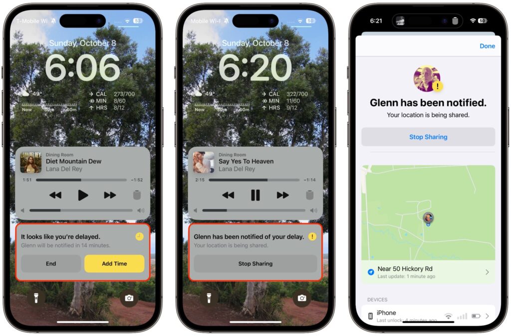
  • Check In fails to end (safety partner): More interesting is what your safety partner sees if you fail to complete a Check In. They’ll be alerted and can tap Details to see your location, when your devices were last unlocked, and more. They then have to figure out the best way to respond given your setup conversation.
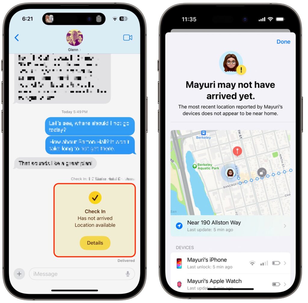
It can take some practice to become fluid with Check In, so it’s worth testing it in everyday situations before using it when it might really matter. Once you use it a few times, you may notice Siri Suggestions offering to start it for you, making it even easier to initiate regularly. We hope you find that it provides some peace of mind and, in the worst-case scenario, helps someone in need of emergency services.

(Featured image by iStock.com/PeopleImages)

Four Solutions to Gotchas in macOS 14 Sonoma

We’re seeing an increasing number of people switching to macOS 14 Sonoma, and for the most part, things are going well. However, Apple introduced some new features—and turned them on by default—that are causing some consternation. If you’ve switched to Sonoma or are planning to soon, here are four features you might want to know about.

Hide Windows when Clicking on the Desktop

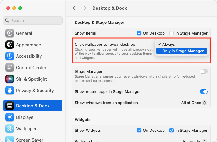
The most immediately surprising thing you’ll notice when you upgrade to Sonoma is that clicking an empty area on the desktop moves all windows off to the side to give you full access to icons and widgets on your desktop. It’s not a bad feature, but if you’re accustomed to clicking the desktop simply to switch to the Finder, it can be off-putting. To keep windows where they are, open System Settings > Desktop & Dock, and under Desktop & Stage Manager, where it says “Click wallpaper to reveal desktop,” choose Only in Stage Manager.

Apple has introduced additional interlocking settings here, so you might want to play with them to see if they support your preferred working style. In particular, note the Show Items checkboxes—if you don’t like seeing all your desktop icons, deselect the On Desktop box to make those icons appear only when you click the desktop.

Print Queue Apps Are Now Part of Print Center

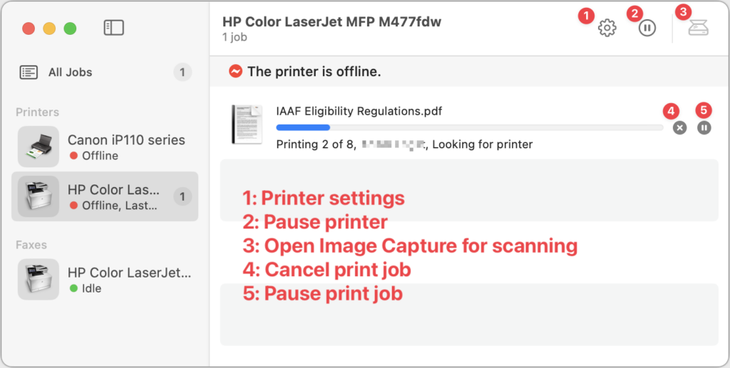
For many years, when you printed from a Mac, a print queue app launched to show the progress of your print job and quit automatically once the job was completed. Some people kept those print queue apps in the Dock afterward, perhaps as a way of accessing a multifunction printer’s scanner. Upgrading to macOS 14 Sonoma broke those Dock icons because individual print queue apps have been replaced by the new Print Center app.

Print Center now launches automatically to show print job progress, but you can also open it manually from the Application folder’s Utilities folder. It also offers options to manage the printer and launch Image Capture, Apple’s default interface for scanning. If you’ve been surprised by printing changes in Sonoma, take a few minutes to familiarize yourself with Print Center.

Gestures Can Trigger Fireworks and Other Effects

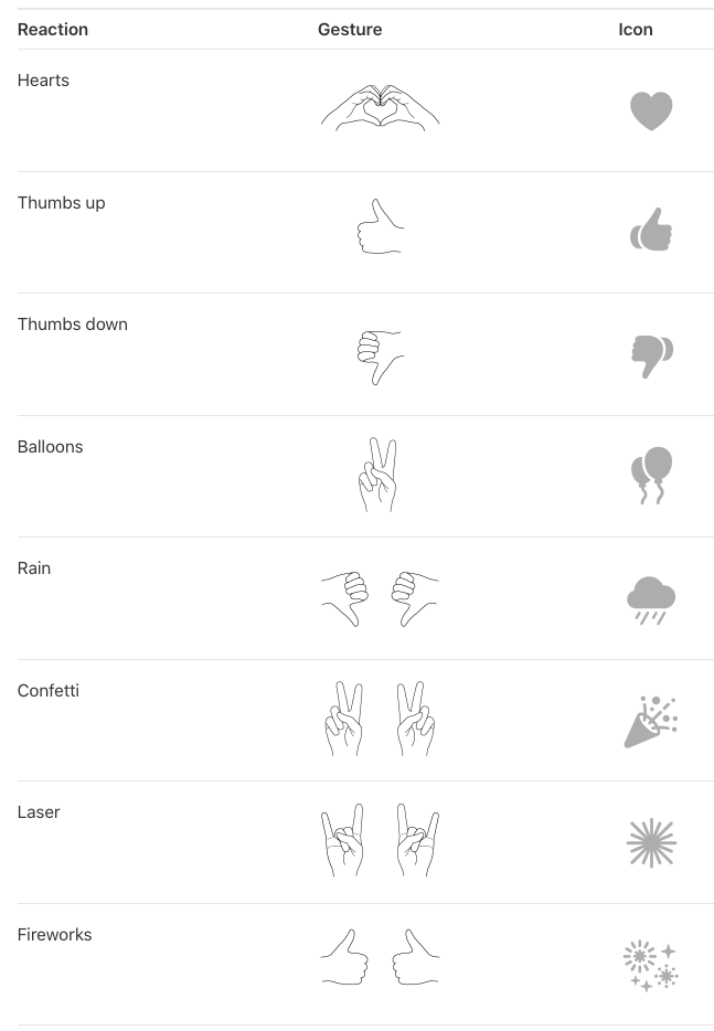
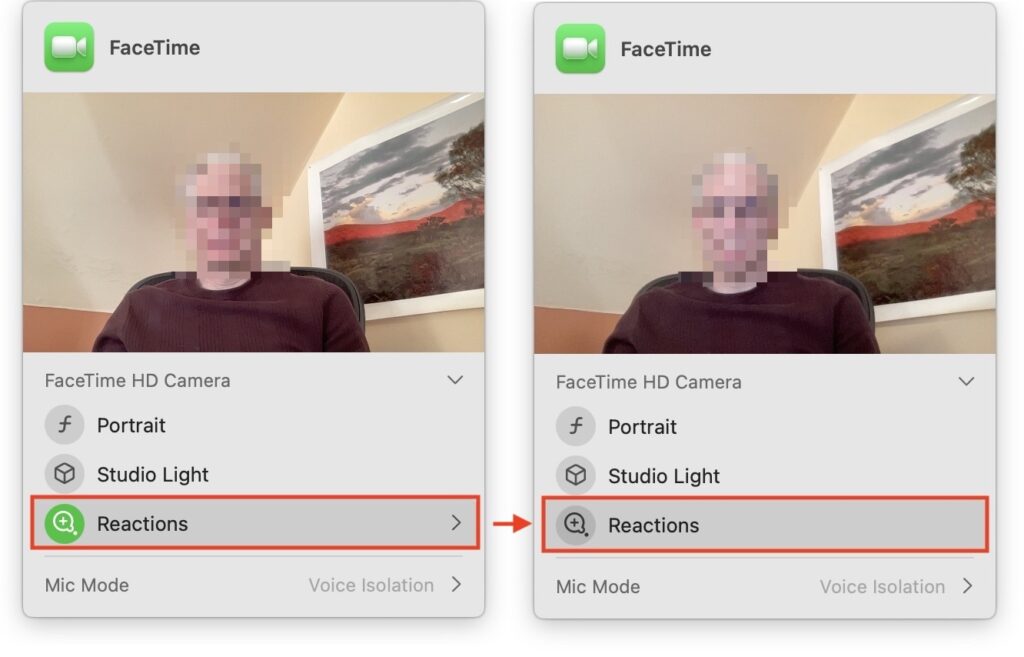
In Sonoma, when you’re in a video call using FaceTime, Zoom, Webex, or another supported videoconferencing app, making certain hand gestures will trigger special effects. (This works only on a Mac with Apple silicon or when using an iPhone as your webcam.) These reactions are fun… except when they’re not. A double thumbs-down gesture that generates rain during a therapy session may be utterly inappropriate, and causing balloons to fall during a serious business meeting just because you inadvertently made a V with your index and middle fingers might not be considered amusing. Here are the gestures and what they trigger.

To ensure you don’t accidentally generate a reaction with a stray gesture, click the green video camera icon that appears in your menu bar when using one of the apps that supports reactions. (You must be actively sending video—just having the app open may not be sufficient to make the green icon appear.) Then click Reactions under your preview so it goes from having a green icon to a gray icon. Reactions are now disabled. That app should remember your preference, but you’ll have to turn off reactions separately in every app where they’re available.

New Privacy Awareness Icons

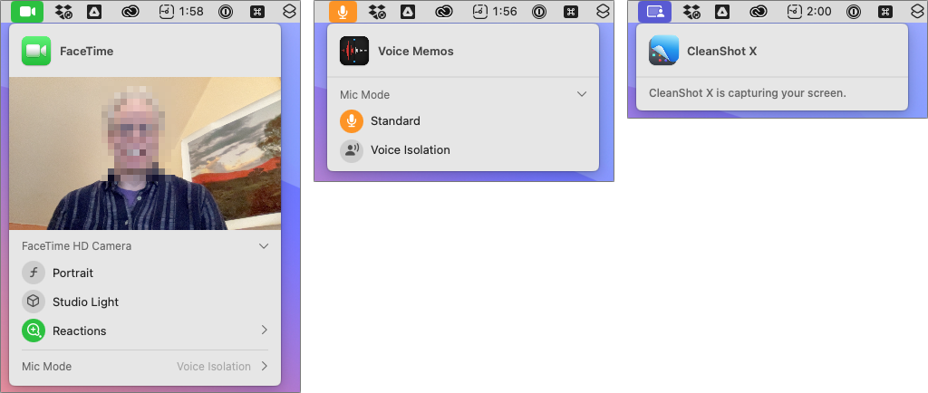
That green video camera icon that appears in your menu bar when sending video in Sonoma isn’t the only one that can appear in that spot, and we’ve fielded questions from people who are surprised and confused by these icons appearing. Don’t worry; they aren’t an indication of malware on your Mac! Apple added them so you’d always be aware when an app was using your Mac’s camera or microphone, or recording the screen. You can think of them as an expansion of the tiny green LED that lights up next to the Mac’s camera when it’s in use.

The three icons you might see are:

  • Green camera, which indicates that the Mac’s video camera is in use. The microphone may also be active, but that’s not indicated separately.
  • Orange microphone, which shows that the Mac’s mic is recording audio.
  • Purple screen, which tells you that an app is recording your screen. Beyond screen-sharing apps, other apps like screenshot utilities can trigger this icon.

Click the icon to see what app is involved. You could even see multiple apps listed at the top, if several apps are recording the screen, for instance.

If you’ve switched to Sonoma already, we hope this quick tour of a few potentially confusing features has helped explain what’s going on. And if you’re still waiting to install Sonoma—which is fine!—remember to come back to this article when you decide to upgrade.

(Featured image based on an original by iStock.com/fizkes)

Nine Tips for Switching from an iPhone with Touch ID to One with Face ID

In 2013, Apple added Touch ID to the Home button of the iPhone 5S. Taking advantage of the uniqueness of fingerprints, Touch ID combines the Home button press to wake up the iPhone with a fingerprint scan to authenticate the user. But in 2017, Apple introduced the iPhone X with Face ID, which relies on cameras and sensors at the top of the screen to authenticate the user via facial recognition. Since then, Apple has slowly been phasing out Touch ID in the iPhone line, with only the third-generation iPhone SE still supporting it. (Only the iPad Pro models have Face ID; other iPads have Touch ID in the Home button or the top button.)

We’re not here to dub one better than the other, but many people find themselves needing to upgrade from an older iPhone with Touch ID to a newer one with Face ID. If you’re trying to switch between Touch ID and Face ID, we have some tips to help.

Unlock the iPhone

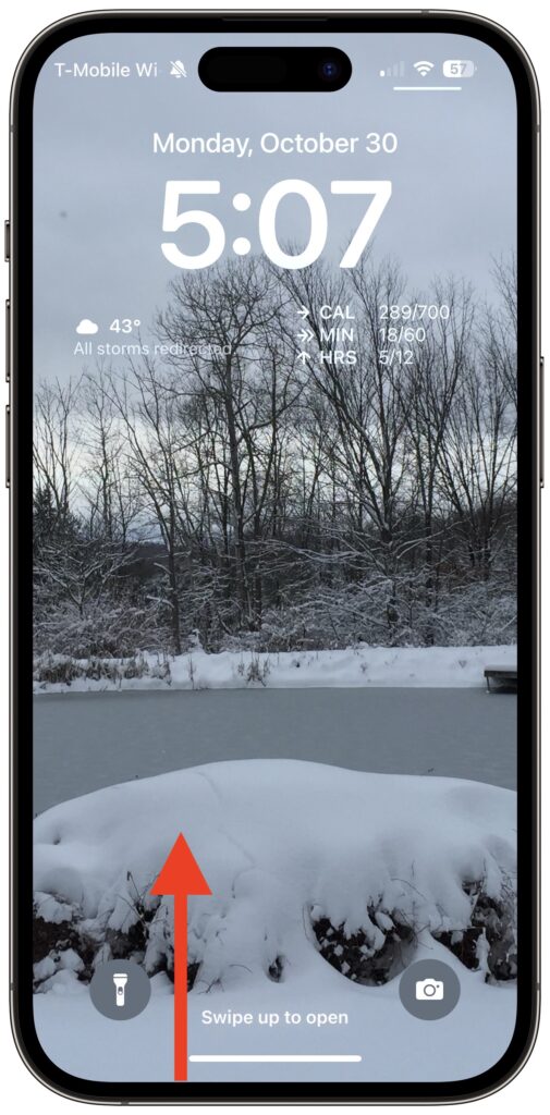
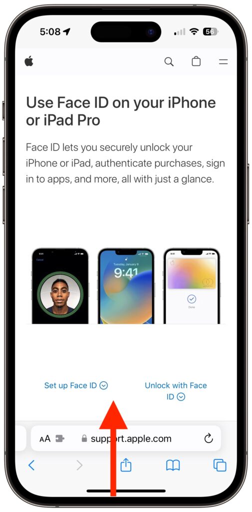
Once the iPhone is awake (the screen is lit up), you unlock an iPhone with Touch ID by pressing the Home button. On an iPhone with Face ID, you swipe up from the bottom of the Lock Screen—a bar reminds you where to start—while looking at the iPhone. Face ID is fast and accurate enough that you’ll notice that authentication is happening only if iOS asks to verify your passcode (which it also does with Touch ID).

Return to the Home Screen

When you’re using an app on an iPhone with Touch ID and want to return to the Home Screen, you press the Home button—logical! On an iPhone with Face ID, you repeat that swipe up from the bottom of the screen action you use to unlock the iPhone. You’ll get really good at it.

Switch between Apps

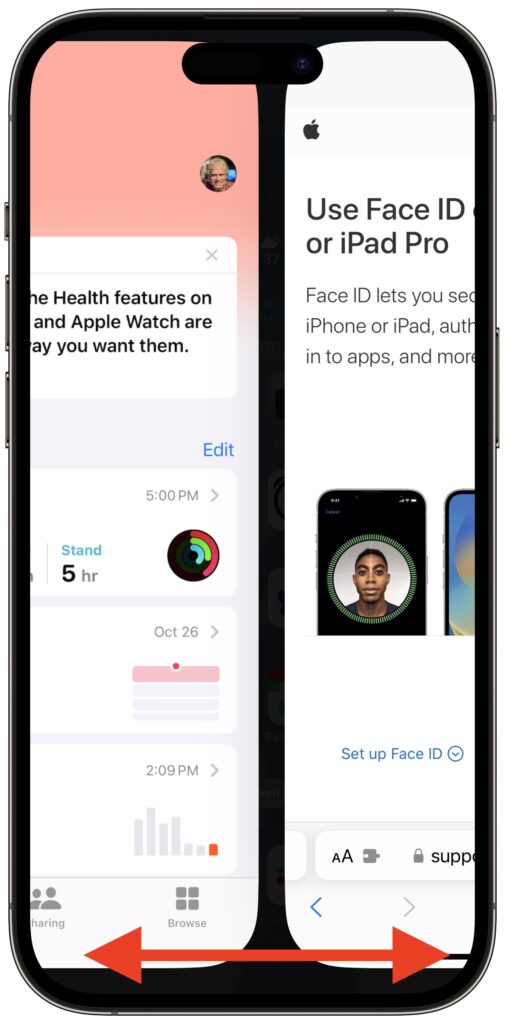
When it comes to switching between apps, iPhones with Face ID offer a unique shortcut. On an iPhone with Touch ID, you must quickly press the Home button twice and then swipe between apps in the App Switcher. Bringing up the App Switcher on an iPhone with Face ID requires swiping up from the bottom of the screen just slightly and then continuing the swipe to the right. But Face ID experts seldom do that. Instead, swipe right and left on the bar at the bottom of the screen to switch between apps—it’s far faster and easier, if hidden.

Activate Siri

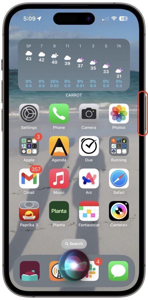
On an iPhone with Touch ID, holding the Home button activates Siri. On an iPhone with Face ID, press and hold the side button to activate Siri. Tomato, tomahto.

Open Control Center

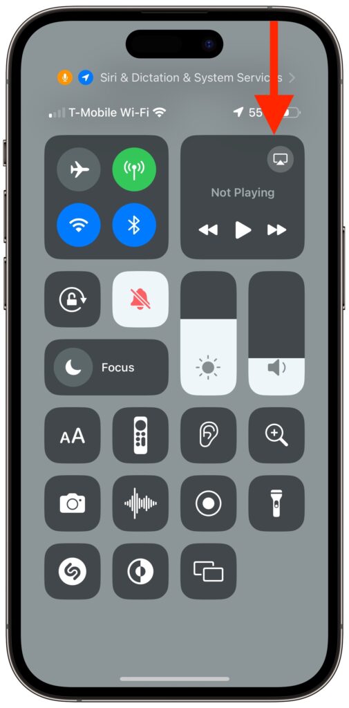
When all we had were iPhones with Touch ID, Apple decided we’d open Control Center by swiping up from the bottom of the screen. Face ID relies on that gesture for unlocking and opening the App Switcher, so on iPhones with Face ID, you instead open Control Center by swiping down from the top right of the screen. Think of it as swiping down from the cellular, Wi-Fi, and battery status icons.

View Notifications

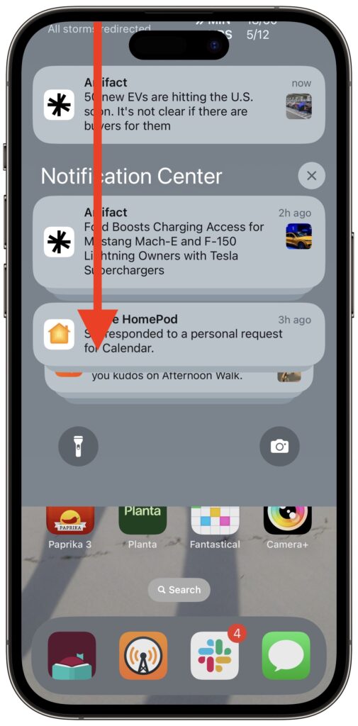
Because iPhones with Touch ID use a swipe up from the bottom for Control Center, they can devote a swipe down from the top of the screen to displaying the Lock Screen with notifications. The same gesture works on an iPhone with Face ID, but you must start from the left side of the screen.

Use Apple Pay

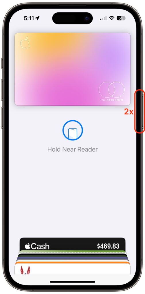
Paying for a purchase with Apple Pay requires that you authenticate, which means placing your finger on the Home button—but not pressing it!—on an iPhone with Touch ID. Getting the hang of the touch-but-don’t-press action can take some time, but once you have it, you may even have developed a habit of not looking at your iPhone to authenticate Apple Pay. In contrast, with an iPhone with Face ID, you must look at the screen when prompted so the Face ID sensors can confirm you’re making the purchase. Honestly, neither is as easy as double-pressing the side button on an Apple Watch.

Authenticate in Apps

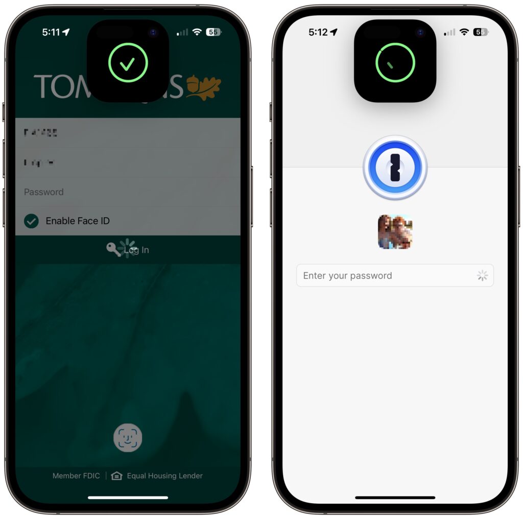
Beyond Apple Pay, plenty of apps from the App Store, like password managers and banking apps, tie into biometric authentication so you don’t have to type lengthy passwords. As you’d expect, if you previously authenticated by touching the Home button, doing so on an iPhone with Face ID requires looking at the iPhone screen. That’s nearly always what you do anyway, so it’s even easier than touching the Home button.

Register Alternate Appearances

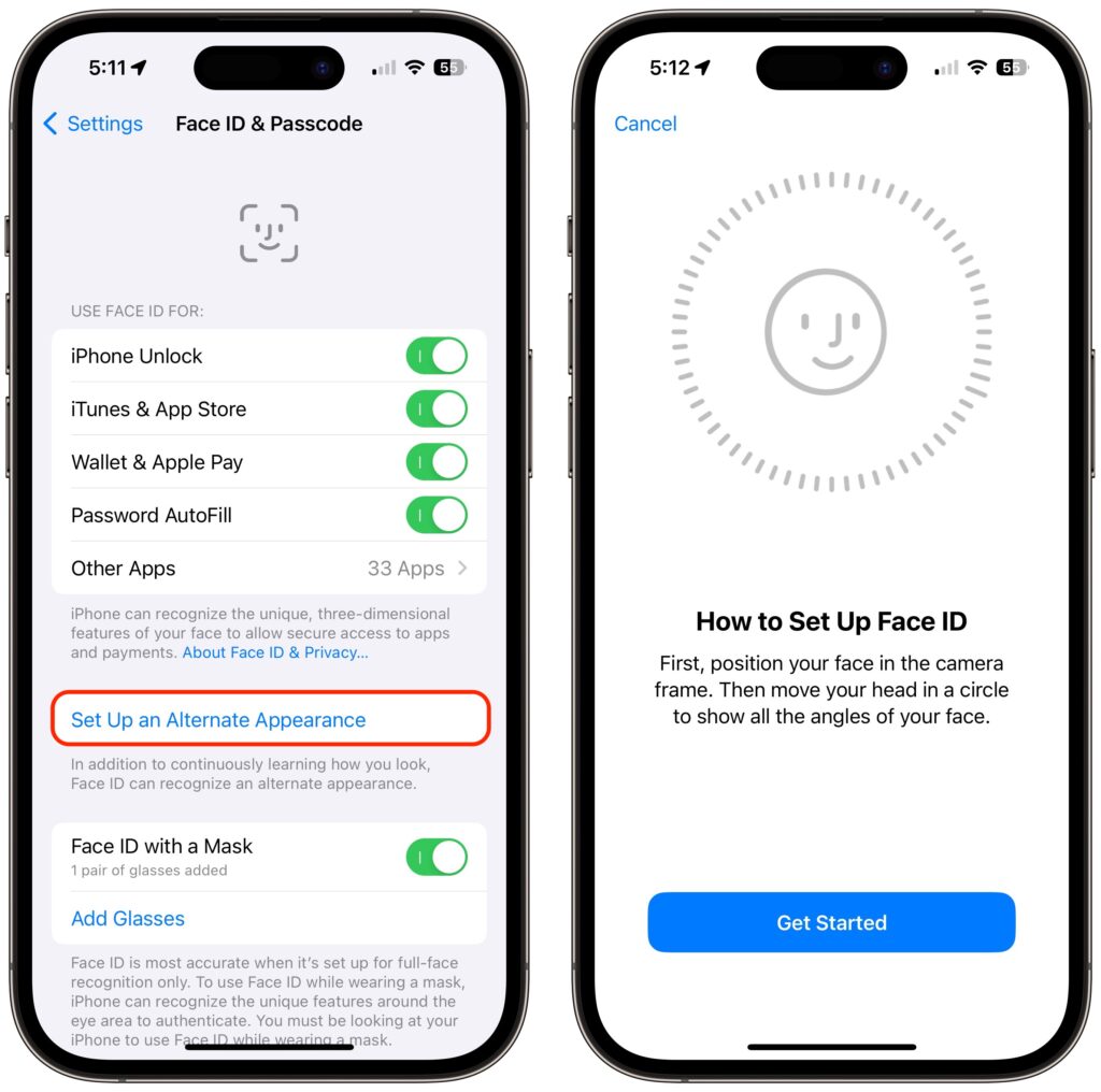
With Touch ID, you can register up to five fingers, which lets you use several of your own and let a trusted spouse or family member authenticate using Touch ID as well. We tend to have more fingers than faces, though, so with Face ID, Apple allows only a single alternate appearance. That shouldn’t be too limiting, but if everyone in your family had a Touch ID finger, sorry, you’ll have to pick a favorite.

(Featured image by Apple)

New M3 Chip Family Powers Updated MacBook Pros and 24-inch iMac

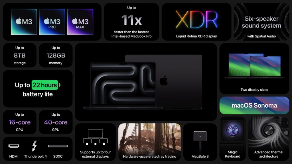
At Apple’s Halloween-themed Scary Fast event on October 30, the company unveiled its next-generation Apple silicon chips for Macs, the M3, M3 Pro, and M3 Max. Apple also showcased new 14-inch and 16-inch MacBook Pro models and a faster version of the 24-inch iMac based on these chips. They’re available to order now, with units in stores and orders starting to arrive on November 7, apart from the M3 Max models that will arrive in late November. Apple also dropped the awkwardly positioned 13-inch MacBook Pro model from the lineup, leaving the low end to the highly capable MacBook Air.

Apart from the new chips, the updated MacBook Pro models boast only a brighter screen, a slightly longer battery life in the M3 14-inch model, and a new Space Black aluminum finish for the M3 Pro and M3 Max models. There are no other changes for the M3 24-inch iMac.

M3, M3 Pro, and M3 Max Bring More Power to the 14-inch and 16-inch MacBook Pro

Although the MacBook Air has done an admirable job of supporting everyday laptop users, professionals who rely on processor-intensive apps have long turned to the 14-inch and 16-inch MacBook Pro for more power. Apple updated the MacBook Pro to the M2 Pro and M2 Max in January 2023, a release that probably came later than Apple wanted. There’s less reason to upgrade from an M2 model to a new M3 one, but the performance gains are significant when upgrading from Intel-based and M1 models.

The M3 MacBook Pro models beat the equivalent Intel-based MacBook Pro models by 3x, 5.5x, 7.4x, and even 20x, depending on the specific app and task. Overall, Apple claims speed improvements up to 11x over the fastest Intel-based MacBook Pro. Gains over equivalent M1-based MacBook Pros are also significant, with improvements from 30% to 60%.

Apple expanded the options for the 14-inch MacBook Pro, so there are now three basic configurations:

  • M3 starting at $1599: It has an 8-core CPU, 10-core GPU, 8 GB of memory, and 512 GB of storage. You can (and probably should) jump to 16 GB of memory; 24 GB is also available. This model has only two Thunderbolt/USB 4 ports and can drive only a single external display.
  • M3 Pro starting at $1999: You have two options here: either 11 or 12 CPU cores and 14 or 18 GPU cores, and either 18 GB or 36 GB of memory. These models feature three Thunderbolt/USB 4 ports and support one or two external displays.
  • M3 Max starting at $3199: The maxed-out configuration also sports two options: either 14 or 16 CPU cores and 30 or 40 GPU cores, plus 36 GB of memory, upgradeable only to 96 GB. These models also have three Thunderbolt/USB 4 ports but can drive up to four external displays.

The 16-inch MacBook Pro has only M3 Pro and M3 Max configurations:

  • M3 Pro starting at $2899: There’s only one option here, matching the beefier 14-inch M3 Pro model: a 12-core CPU, 18-core GPU configuration with 36 GB of memory.
  • M3 Max starting at $3499: The choices here are either 14 or 16 CPU cores and 30 or 40 GPU cores. The lower-end configuration comes with 36 GB of memory and can upgrade to 96; the higher-end configuration has 48 GB of memory and has options for 64 GB or 128 GB.

Storage starts at 512 GB for the M3 14-inch model and 1 TB for the rest, with options for 2 TB, 4 TB, and 8 TB.

Note that the M3 14-inch MacBook Pro replaces the awkwardly positioned M2 13-inch MacBook Pro, which offered only the slightest advantage over its cheaper M2 13-inch MacBook Air cousin. The new M3 14-inch MacBook Pro does cost $100 more than the comparable 13-inch MacBook Pro that it replaces, but that’s a fair trade for the bigger, better screen and 1080p FaceTime HD camera. Now there’s once again a clear physical and performance distinction between the MacBook Air and the MacBook Pro lineups.

Otherwise, some prices have increased, but in most cases, that may be because the new configurations include more unified memory. For instance, the M3 Pro 16-inch MacBook Pro previously started at $2499 with 16 GB of memory, but now starts at $2899 with 36 GB of memory. Regardless, the professionals buying these speedy Macs can often justify paying more if the performance boost directly increases productivity.

M3 Chip Improves 24-inch iMac Performance

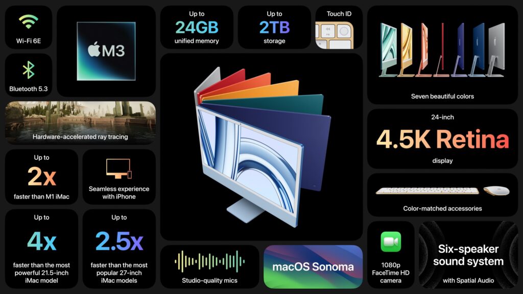
There isn’t much to say about the refreshed 24-inch iMac, which trades its M1 chip for an M3 but sports no other notable changes and keeps its $1299 starting price. The 24-inch iMac remains an attractive option for anyone looking for an all-in-one desktop Mac.

The switch to the M3 does provide more memory choices. Previously, you could choose only 8 GB or 16 GB of memory. With the M3, 8 GB of memory remains standard, but you can upgrade to either 16 GB (a good idea) or 24 GB (probably unnecessary for most people). Storage still starts at 256 GB, which isn’t much these days, particularly if you take a lot of photos or videos, and you can upgrade to 512 GB, 1 TB, or 2 TB.

Apple gave no hints that it is considering a replacement for the popular 27-inch iMac that Apple discontinued when it introduced the Mac Studio and 27-inch Studio Display. Though the 24-inch iMac has an impressive 4.5K Retina display, it’s still smaller than the 5K Retina display in the 27-inch iMac. Speculation has swirled around the possibility of a 32-inch iMac Pro, but given that a Mac Studio starts at $1999 and the 32-inch Pro Display XDR sells for $4999, it’s hard to imagine such an iMac Pro having a competitive price.

Also missing from the announcement was any mention of USB-C versions of the Magic Keyboard, Magic Trackpad, and Magic Mouse. Those accessories continue to use the Lightning connector and ship with a USB-C to Lightning cable for charging.

(Featured image by Apple)

At WWDC23, Apple Releases New Macs, Previews New OS Features, and Unveils Vision Pro

Apple’s Worldwide Developer Conference keynote (full video or 2-minute recap) is primarily an opportunity for Apple to give developers a first look at new features coming in its operating systems, and this year was no exception. However, Apple sandwiched those feature reveals between announcements of new Macs and the unveiling of its mixed-reality Vision Pro headset, due next year. Here’s what you should know.

New Macs Complete the Transition to Apple Silicon

Apple introduced three new Macs, the 15-inch MacBook Air, Mac Studio models with faster chips, and the first Apple silicon Mac Pro, all of which are available to order now and start shipping on June 13.

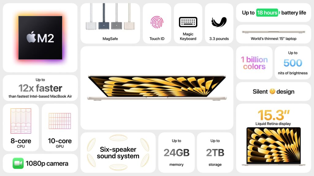
  • 15-inch M2 MacBook Air: This new consumer-level laptop is nearly identical to the 13-inch M2 MacBook Air, apart from its 15.3-inch screen and array of six speakers. It starts at just $1299, and the 13-inch model drops $100 to start at $1099. It’s an excellent machine for students or anyone who wants a highly capable laptop with a larger screen for less than the 14-inch or 16-inch MacBook Pro.
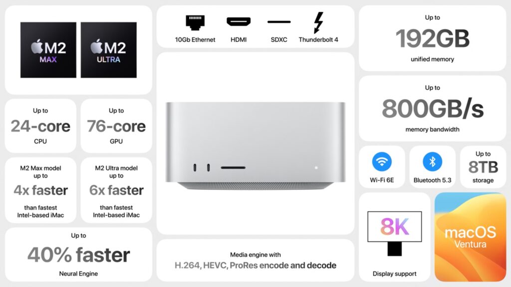
  • Mac Studio: The new Mac Studio is unchanged other than swapping last year’s M1 Max and M1 Ultra chips for the higher-performance M2 Max and new M2 Ultra, which combines two M2 Max chips. The M2 Ultra boasts a 24-core CPU, lets you choose between 60-core and 76-core GPU models, offers a higher unified memory ceiling of 192 GB, and can drive up to eight displays. The improvements may not be worth replacing an M1-based Mac Studio, but the gains over an Intel-based iMac or Mac Pro are significant. Pricing starts at $1999 for the M2 Max and $3999 for the M2 Ultra.
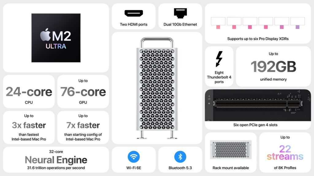
  • Mac Pro: The long-awaited Mac Pro retains the form factor of the last Intel-based Mac Pro—complete with $400 optional wheels—but differs radically inside. It relies on the same M2 Ultra chip as in the Mac Studio but has open slots for six full-length PCI Express gen 4 cards and provides eight built-in Thunderbolt 4 ports. Apple claims it is 3–7 times faster than the Intel-based Mac Pro, but the details will likely vary by situation. For instance, the M2 Ultra reportedly provides the performance of seven of Apple’s $2000 Afterburner cards for accelerating ProRes and ProRes RAW video codecs. But the M2 Ultra maxes out at 192 GB of unified memory that’s faster and more efficiently used, whereas the Intel-based Mac Pro could accept up to 1.5 TB of traditional RAM. Pricing starts at $6999 for a tower enclosure and $7499 for a rack enclosure. It’s big iron for demanding workflows.

With the release of the Mac Pro, Apple dropped the last Intel-based Mac from its lineup. That doesn’t mean the company will stop supporting recent Intel-based iMacs in the next version or two of macOS, but that will happen sometime in the next few years. Plan to replace Intel-based Macs eventually—you’ll appreciate the significant performance gains from Apple’s M-series Macs.

Top New Operating System Features Coming in 2023

As always, Apple previewed oodles of new features while covering many more on its website. We’ll focus on those we think will make the biggest splash in your Apple experience, but take a moment to scroll through Apple’s pages for each operating system to see the full list of what’s coming. Those are linked below, along with their basic system requirements so you can see if your devices will be eligible to upgrade (not all features will be available on all devices):

    • macOS Sonoma: iMac Pro from 2017. MacBook Air, MacBook Pro, and Mac mini from 2018 and later. iMac and Mac Pro from 2019 and later. Mac Studio from 2022 and later.
    • iOS 17: Second-generation iPhone SE, iPhone XR, and later
    • iPadOS 17: Sixth-generation iPad and later, fifth-generation iPad mini and later, third-generation iPad Air and later, and second-generation iPad Pro and later
    • watchOS 10: Apple Watch Series 4 and newer, including the Apple Watch SE
  • tvOS 17: Apple TV 4K, with fewer features on the older Apple TV HD

Here are some new features we think will most impact your Apple experience.

Contact Posters

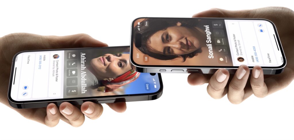
Although you can share your preferred photo with others for use in Messages, Contacts, and Photos, when you call someone, all they see is your name. In iOS 17, Apple is introducing Contact Posters, which let you pick a photo or Memoji, along your preferred font. Then the Contact Poster will appear whenever you call someone, making it easier for them to identify who’s calling at a glance.

FaceTime Support on Apple TV

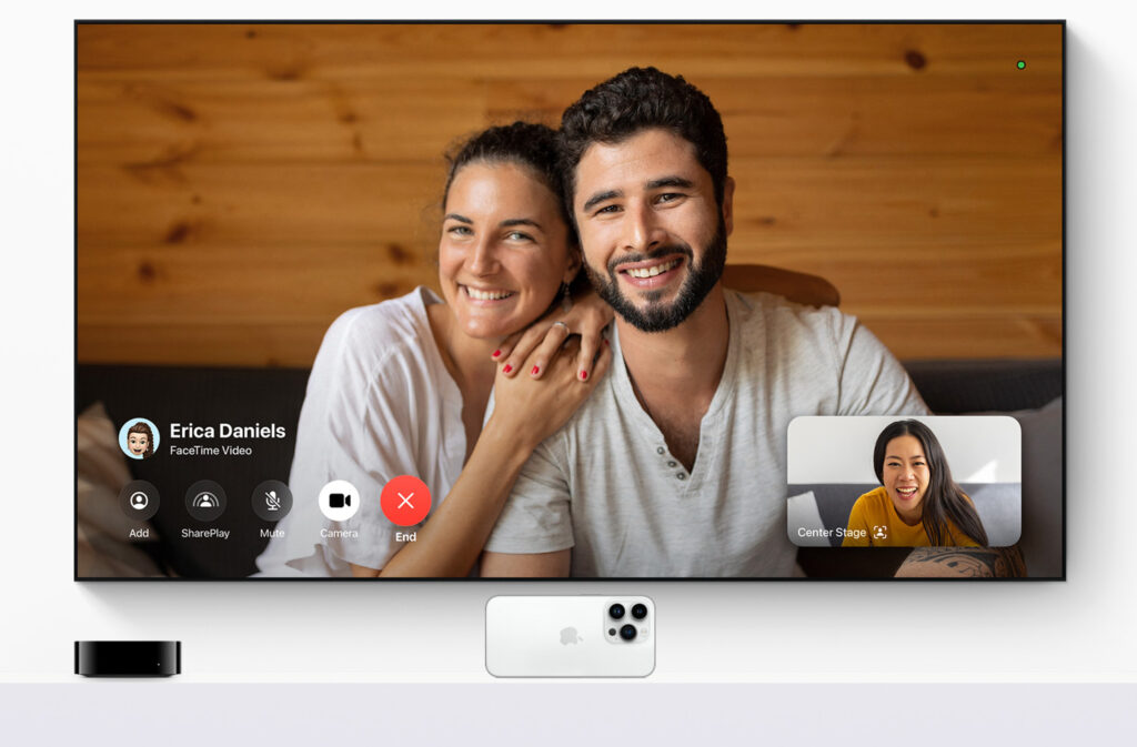
Wouldn’t it be nice if you could take a FaceTime call on your living room TV? It wasn’t impossible before, but Apple didn’t make it easy. With tvOS 17 on an Apple TV 4K, you’ll be able to leverage your iPhone or iPad camera and microphone through Continuity Camera to bring FaceTime conversations to the biggest screen in the house. Center Stage will let you move around the room while staying framed onscreen, and gesture-based reactions let callers create onscreen effects. These capabilities will also arrive later this year for other videoconferencing systems like Zoom or Webex, creating another reason to put an Apple TV in the conference room.

Desktop Widgets on the Mac

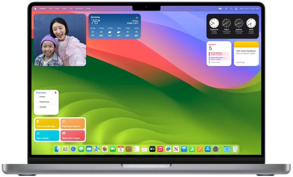
Widgets have become commonplace on iPhone and iPad Home screens, but on the Mac, they’ve been relegated to Notification Center. With macOS Sonoma, widgets can now migrate to the desktop, where you can position them anywhere. They’re also interactive, enabling you to control music, toggle the lights, and mark reminders as done. Thanks to Continuity, you can add your iPhone widgets to the Mac desktop, even when there’s no Mac app. Your iPhone has to remain nearby or on the same Wi-Fi network. Remember that you can use a hotkey or hot corner to slide all your windows aside to reveal your desktop at any time.

NameDrop for Sharing Phone Numbers

Sharing phone numbers has never been easier with the new NameDrop feature. Just hold your iPhone near someone else’s iPhone or Apple Watch (Series 6 or later, sometime after the initial watchOS 10 release) to exchange contact information—which you select—along with your Contact Poster. Alas, you’ll still have to type in phone numbers for Android users manually.

Web Apps in Safari

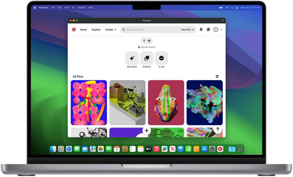
We all have websites that we use heavily, just like a native Mac app. If there’s no Mac version of the app, Safari in macOS Sonoma will let you add the website to your Dock, where it will look and work like a standalone app with its own window, toolbar, and notifications. (If you’re longing for this capability now, check out Unite from BZG.)

Five More Welcome Features

For more reasons to upgrade once these new operating systems are out and stable, consider the following additional features:

  • Live Voicemail: While someone is leaving you a message, Live Voicemail transcribes it and displays it onscreen so you can decide if you want to pick up or not.
  • AirTag sharing: No more awkward notifications when one family member has an AirTag that ends up traveling with other family members.
  • No more “Hey” with Siri: We can hope Siri becomes better at listening, but at least Apple’s letting us invoke Siri with a single word now.
  • Simultaneous dictation and keyboard use in macOS: Being able to dictate and edit text with the keyboard simultaneously has been great in iOS 16, and with macOS Sonoma, you’ll be able to enter text on your Mac just as fluidly.
  • PDF form filling: It will get easier to fill forms in PDFs, with iOS 17, iPadOS 17, and macOS Sonoma automatically filling in your contact information. It’s supposed to work even with scanned PDFs.

Apple usually releases its new operating systems in September or October, and we’ll be writing more about them as we have a chance to test them. Generally speaking, it’s OK to upgrade to everything but macOS shortly after release; with macOS, we recommend caution to ensure all your existing apps and workflows won’t be impacted.

Apple Unveils Vision Pro “Spatial Computer”

And now for something completely different. Apple devoted the final third of its keynote to unveiling a mixed-reality headset it calls Vision Pro. Even though it fits on the user’s head like bulbous ski goggles, Apple prefers to call it a spatial computer. That’s probably to avoid charged terms like metaverse, although the Vision Pro does provide both augmented reality, where digital objects are superimposed on a view of the real world, and virtual reality, where an immersive digital environment blocks out the real world.

Apple said the Vision Pro would ship early next year, starting at $3499. The high price accurately reflects the impressive amounts of technology Apple has shoehorned into the device but puts it out of reach for all but the most inquisitive and flush early adopters. What will the Vision Pro make possible for that money?

The Vision Pro blends digital content with the physical world, providing a three-dimensional interface controlled by the user’s eyes, hands, and voice. Users can display apps as floating windows or bring a Mac’s screen into Vision Pro as an enormous 4K display. Along with controls triggered by eye tracking and hand gestures, plus a virtual keyboard, users can use the Magic Trackpad and Magic Keyboard for faster interaction.

FaceTime calls using the Vision Pro take advantage of the space, putting other callers in life-size tiles and providing a shared screen. Speakers in the headset provide spatial audio, so it sounds like people are speaking from where their tiles are positioned. Vision Pro users don’t show up looking like they’re wearing the headset; instead, they’re represented by a digital avatar Apple calls a Persona. Will it escape the uncanny valley?

The Vision Pro is an easier sell for entertainment, where many people prefer immersive experiences, whether watching a movie on what seems like a 100-foot screen or playing a game where you see nothing but its virtual world. A Digital Crown lets the user control how much of the physical world seeps through around the edges.

If you’re thinking it would be unsettling to be in the same room with someone wearing a Vision Pro, you’re not alone. In an attempt to reduce that sense, a technology called EyeSight makes the device seem transparent—it shows an image of the user’s eyes on a front-facing display for others to see. How effective this will be remains to be seen, but it’s hard to imagine the Vision Pro becoming a fashion accessory.

There’s a great deal more to the Vision Pro, such as its ability to record and play back 3D movies with spatial audio, wrap panorama photos around the user, and use familiar iPhone and iPad apps. Despite the incredible hardware and software that Apple has invented to bring the Vision Pro to fruition, it feels like a technology demo. And it does demo well, judging from reports from people like tech analyst Ben Thompson.

But the Vision Pro is at least 6 months from emerging from Apple’s reality distortion field, and many people are already highly dubious that the company’s vision for the future of computing will do a better job with the real-world tasks we already do with today’s digital devices.

(Featured image by Apple)