You Can Now Upgrade to macOS 12 Monterey When You’re Ready

When it comes to upgrading to a new version of macOS, we err on the side of caution, at least in our recommendations. (We often install even beta releases on secondary machines for testing purposes.) Upgrading is easy, but if you upgrade too soon, the new version of macOS could render favorite apps inoperable, create workflow interruptions, and have other negative consequences. On the other hand, waiting too long can cause problems—it’s important so you can stay in sight of the cutting edge for security reasons and take advantage of Apple’s advances. Upgrading is not an if question; it’s a when question.

That “when” could be now. There’s no reason you must upgrade to macOS 12 Monterey right away, but if you want to, you should now be able to do so without undue interruptions. Monterey has been quite stable and has needed only two updates since its initial release in October 2021. The macOS 12.1 feature release in December 2021 added support for SharePlay, the Apple Music Voice Plan, Memories improvements in Photos, and Legacy Contacts, along with bug fixes and security updates. The macOS 12.2 maintenance release from January 2022 includes only unspecified bug fixes and some security updates. The upcoming macOS 12.3 will add the long-promised Universal Control feature for controlling multiple Macs and iPads from one keyboard and mouse. After that, Monterey should be feature-complete and will likely receive only bug fixes and security updates.

You can continue to delay as long as you’re running macOS 10.15 Catalina or macOS 11 Big Sur and are staying up to date with Apple’s security updates. Earlier versions of macOS no longer receive security fixes, rendering them more vulnerable to attack. Reasons to delay further include:

    • You’re too busy. The upgrade process will take a few hours, and it may take additional time to configure everything properly afterward. When you are ready to upgrade, aim for when a little downtime will be convenient.
    • You’re using incompatible software. The jump from Catalina or Big Sur to Monterey isn’t a big one, so most modern apps should have been updated to ensure compatibility with Monterey by now. But if you’re still running macOS 10.14 Mojave or earlier with 32-bit apps, you’ll lose access to them if you upgrade. (That happened first with Catalina.) With Mojave no longer receiving security updates, you need to find replacements for those apps and upgrade soon.
  • You need consistent versions for workflow reasons. We’re unaware of any major issues here, but it’s not inconceivable that a coworker could be stuck on an older version of macOS and thus older versions of shared productivity apps. If your upgrade would force you to update those apps and introduce compatibility issues when collaborating with that coworker, you may have to wait until your coworker can upgrade as well.

Monterey won’t upend your experience of using a Mac, but it has numerous welcome features, both large and small. Apple radically improved FaceTime, introduced the Shortcuts app from iOS, added privacy enhancements like iCloud Private Relay and Hide My Email, enables you to copy text from images with Live Text, provides screen sharing in FaceTime calls, lets you always display the menu bar in full-screen mode, and much more. Perhaps even more important, Monterey shares numerous features with Apple’s other operating systems: iOS 15, iPadOS 15, watchOS 8, and tvOS 15. To take full advantage of those features across all your Apple devices, your Mac must be running Monterey.

Before You Upgrade

Once you’ve decided to upgrade to Monterey, you have three main tasks:

  • Update apps: Make sure all your apps are as up-to-date as possible. If you regularly put off updates, now’s the time to let them complete so you have Monterey-compatible versions.
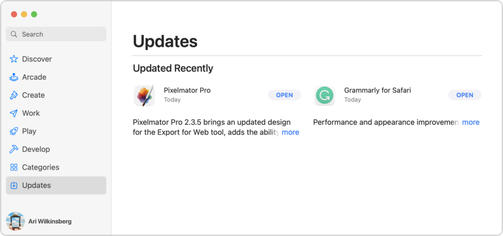
  • Clear space: Monterey needs about 36 GB of free space to upgrade, and the Monterey installer itself is about 12 GB, so we recommend making sure you have at least 50 GB free. Don’t cut this close—you should always have at least 10–20% free space for virtual memory, cache files, and breathing room.
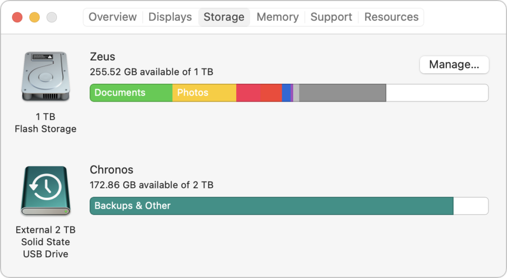
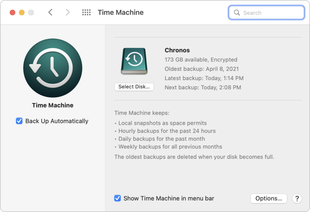
  • Make a backup: Never, ever install a major upgrade to macOS without ensuring that you have at least one current backup first. In an ideal world, you’d have an updated Time Machine backup, a bootable duplicate, and an Internet backup. That way, if something goes wrong, you can easily restore.
Upgrading

After the above-listed tasks are complete, make sure you don’t need your Mac for a few hours. There’s no telling exactly how long the upgrade will take, so never start an upgrade if you need the Mac soon.

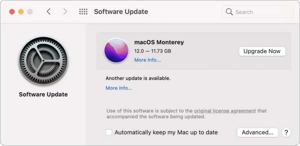
Initiating the upgrade is just a matter of opening System Preferences > Software Update, clicking the Upgrade Now button, and following the instructions. If you’d like more hand-holding, check out Joe Kissell’s ebook Take Control of Monterey.
After You Upgrade

Part of the reason to set aside plenty of time for your Monterey upgrade is that there are usually cleanup tasks afterward. We can’t predict precisely what you’ll run into, depending on what version of macOS you’re running now and what apps you use, but here are a few situations we’ve noticed in the past:

  • macOS may need to update its authentication situation by asking for your Apple ID password, your Mac’s password, and if you have another Mac, its password too. Don’t worry that this is a security breach—it’s fine.
  • Some apps may have to ask for permission to access your contacts and calendar even though you previously granted permission. Again, that’s fine and won’t happen again.
  • If you use your Apple Watch to unlock your Mac and apps (and you should, it’s great!), you may need to re-enable that in System Preferences > Security & Privacy > General.
  • If you use Gmail, Google Calendar, or other Google services, you may need to log in to your Google account again.
  • Websites that usually remember your login state may require that you log in again. If you’re using a password manager like 1Password, that’s easy.
  • You may have to re-enable text message forwarding to your Mac on your iPhone in Settings > Messages > Text Message Forwarding.

With all that housekeeping done, it’s time to check out all the new features in Monterey!

(Featured image by Apple)

Looking for a New Email Provider? Try These Services

If you’re completely happy with your email provider, move on, there’s nothing to see here. But if you’re unhappy with your provider’s reliability, spam filtering, or stability as a business, or if you’re tired of having a 1990s-style address from aol.com or hotmail.com, you can switch. There are innumerable email providers, and many are undoubtedly good at what they do. But we’ve seen these services performing the best over the years. We’ll start with recommendations for business and then look at options for individuals.

Business Accounts

For a business, email is essential. You cannot put up with downtime, lost email, unpredictable spam filters, or any other nonsense. Plus, you need support for custom domains, multiple users, role accounts, two-factor authentication, and an admin console where you can manage it all (or someone can manage it for you). Although there are other providers in this space, the safe choices are Google and Microsoft. (We realize this falls into the category of “No one ever got fired for buying IBM.” It’s basically true in this case—email isn’t an area to experiment with unknown quantities.)

  • Google Workspace: Previously known as G Suite, Google Workspace brings together Google’s well-known collaboration tools, including Gmail, Calendar, Drive, Docs, Sheets, Forms, Slides, and so on. Pricing starts at $6 per user per month and includes 30 GB of cloud storage per user; $12/user/month increases that to 2 TB. The big win of Google Workspace is that it provides a first-class experience for use within a Web browser. Google also provides iOS apps, and Apple’s Mail apps can access Gmail via IMAP.
  • Microsoft 365: Previously known as Office 365 (what is it with all this renaming?) Microsoft 365 offers Web and mobile versions of the Office apps (Outlook, Word, Excel, PowerPoint, and OneNote) along with hosted email with a 50 GB per user mailbox. 1 TB of OneDrive cloud storage space is standard, along with online meetings and video calls using Microsoft Teams. The Basic plan costs only $5/user/month, but to get the desktop versions of the Office apps, you need at least the Standard plan, which runs $12.50/user/month.

The main way to decide between Google Workspace and Microsoft 365 is to examine how focused your business is on core productivity apps. If you’re already relying heavily on Word, Excel, and PowerPoint, it makes sense to go with Microsoft. However, if your company is more Web-based or uses a variety of non-Microsoft productivity apps, Google is probably the better option.

Either way, it’s a big decision, and please check with us before making any major moves. Depending on your situation, there may be less obvious reasons to choose one or the other, or even a third option that’s perfect for your situation. Plus, transitioning between providers may require significant work to ensure that you retain all your email archives.

Individual Accounts

For individual users, you want reliability and good spam filtering, and some people might appreciate being able to use a custom domain name. However, most people don’t need support for multiple users, an admin console, or other big-company features. Plus, you probably don’t want to pay much, if anything. Again, tons of companies offer email—many for free—but the ones we recommend are Apple, Google, and Fastmail:

  • iCloud Mail: Nearly every Apple user has an iCloud account associated with their Apple ID, and with it comes iCloud Mail. It’s a fine choice for basic email, making it easy to access your messages on all your Apple devices and even on the Web at iCloud.com. Apple provides 5 GB of storage for free, which might seem like plenty for email, but it’s shared with iCloud Backup, iCloud Photos, iCloud Drive, and more, so it’s easy to run out. For more storage, upgrade to iCloud+, which costs $0.99 for 50 GB, $2.99 for 200 GB, and $9.99 for 2 TB. With iCloud+, you also get the option of adding a custom domain name, though it’s a rather involved process. The main thing we don’t like about iCloud Mail is that Apple sometimes goes overboard with spam filtering.
  • Gmail: The most popular email service in the world is Google’s Gmail, with well over 1.5 billion users. Although the default way to access Gmail is through a Web browser on a Mac or the Gmail app on an iPhone or iPad, you can enable IMAP support to access it using Apple’s Mail apps. There’s also a highly regarded new Gmail-specific macOS app in development called Mimestream. Gmail provides 15 GB of storage for free, which is enough to hold most people for quite some time, and more storage is available inexpensively. Gmail’s spam filtering is generally very good, and unlike iCloud, it doesn’t delete any filtered messages without allowing you to see them first.
  • Fastmail: In contrast with iCloud Mail and Gmail, Fastmail isn’t free—it costs $3/user/month for the Basic plan, but that’s limited to just 2 GB of storage, doesn’t support a custom domain, and requires that you ​​use Fastmail Web and mobile apps. For $5/user/month, the Standard plan increases the storage to 30 GB, lets you set up your own custom domain, and provides full IMAP access so you can use Apple’s Mail or any other standard email app. The big reasons to choose Fastmail are the company’s focus on privacy and to support a firm that does nothing but email.

Although switching your personal email isn’t as difficult as changing email providers is for a business, it’s still not something to be undertaken lightly. Contact us if you need advice on which service provider would be best for you and if you need assistance setting up forwards and bringing your old mail over to your new account.

(Featured image by iStock.com/anyaberkut)

The Hidden Controls in the iPhone’s Camera App

The beauty of the iPhone camera is that it combines the ease of use of a point-and-shoot camera with the image quality of a DSLR. To take a picture, you simply open the Camera app, frame your shot, and tap the shutter button. Simple, but what’s happening behind the scenes is anything but. The iPhone captures multiple images at once, concentrating on variables such as exposure, focus, tone, highlights, shadows, and more. It then merges all that data to produce what it thinks is the best possible image. Impressively, all this computational photography happens in real-time with no perceptible delay. (That said, iOS 15 provides a Prioritize Faster Shooting option in Settings > Camera that adapts—and presumably reduces—the image quality when you rapidly press the shutter multiple times.)

Despite all this automation, Apple still provides numerous manual controls you can employ to take photos the way you want. These controls are hidden, though, so you’re excused if you haven’t noticed them or have been frustrated looking for them. (“Where is that dratted Timer button? It must be here somewhere!”)

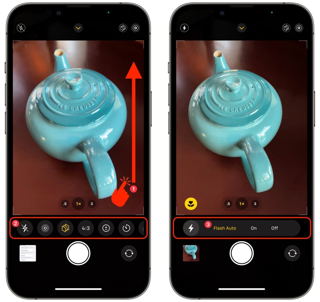
First, you have to reveal the controls, which is easy, although you’d never guess how. When you’re in the Camera app, swipe up anywhere on the screen above the shutter button. If you swipe up on the horizontal row of camera mode labels, your swipe can be quite short. However, if you swipe up on the viewfinder image, the Camera app might interpret a short swipe as a tap-and-swipe and display the in-image exposure control instead. On the viewfinder, use a longer, more emphatic swipe ➊. Either way, the camera controls replace the camera modes underneath the viewfinder ➋.

Once you have the controls showing, tap a button to access its options, use a slider or button to adjust the settings ➌, tap the original button to hide the options, and swipe down in the same way you swiped up to hide all the controls. The really confusing bit is that not all the controls may fit on the screen, so if you’re looking for the Timer or Filter buttons on an iPhone 13 Pro, for instance, you may have to swipe left on the controls to bring those buttons into view.

Here’s the full set—note that all except Depth (the rightmost one below) are in Photo mode; some may also appear in other modes. (Not all controls appear on all iPhone models, and the Low Light button, for instance, shows up only in low-light situations.)

Now, let’s look at what the controls make possible:

  • Flash: Use the Flash control to allow the camera to use the flash as needed or force it to be on or off. You can also control the flash in Video and Slo-Mo modes.
  • Low Light: Night mode on some of Apple’s high-end iPhones makes it possible to take better pictures in very low-light situations. With this control, you can set a specific amount of time for Night mode’s exposure. The longer the exposure, the lighter the photo, but the more small movements will cause blur and graininess.
  • Live Photo: Live Photo records 1.5 seconds of video before and after you take a photo, animating the photo slightly. Use this control to set whether the camera takes Live Photos all the time, none of the time, or automatically when it thinks it’s warranted (which is a lot).
  • Photographic Styles: These custom settings—Rich Contrast, Vibrant, Warm, and Cool—let you apply that distinct look to all your photos automatically. Or stick with Standard and apply the look you want afterward by editing.
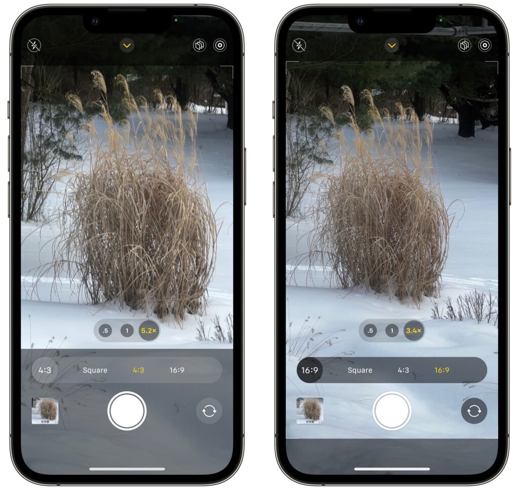
  • Aspect Ratio: Some iPhones can take photos in multiple aspect ratios. Use this control to choose from the standard 4:3 (below left) ratio, square, and 16:9 (below right). The 16:9 ratio expands the viewfinder to show what it will capture.
  • Exposure: Although automatic exposure control is usually fine (and you can adjust it afterward as well), you can use this control to increase or decrease the exposure manually. It’s also available in Video, Slo-Mo, and Time-Lapse modes.
  • Timer: For a hands-free selfie or a group photo that includes the photographer, use this control to set the timer to 3 or 10 seconds, starting from when you tap the shutter button. The iPhone counts down with both flash bursts and an onscreen number.
  • Filter: The Filter button offers nine options, three each in Vivid, Dramatic, and Mono. You may want to turn one of these on to see its effect while composing the shot. Otherwise, it’s easier to apply them in editing later.
  • Depth: This control is available only in the Portrait and Cinematic modes, where it lets you increase or decrease the depth of field. If you increase the depth of field, the background becomes sharper; if you decrease it, the background gets blurrier.

Apart from Photographic Styles, which automatically remembers your setting from session to session, the Camera app generally resets any changes you make in the next session. That’s usually what you’d want, but if you would prefer to keep a setting until you change it manually, go to Settings > Camera > Preserve Settings. That screen provides switches that tell the Camera app to preserve specific settings. Pay particular attention to Creative Controls, Exposure Adjustment, Night Mode, and Live Photo—we often make a point of using Preserve Settings with Live Photo so we don’t waste a lot of space unless we actually want to shoot a Live Photo.

In the end, it’s nice that these controls are neither necessary nor cluttering your view most of the time, but they’re extremely useful on occasion. We hope that Apple comes up with a way of hinting at their existence in future versions of iOS.

(Featured image by iStock.com/Darkdiamond67)