When Should You Upgrade to macOS Sierra, iOS 10, watchOS 3, and tvOS 10?

It’s that time of year again, as the leaves start to turn, the air gets crisp, the grass is covered with frost in the morning, and Apple releases major operating system upgrades. We’ve known this was coming since the company’s announcement in June, but now it’s time to think hard about when you’ll upgrade.

(Note that we say “when” and not “if.” There’s no harm in delaying an upgrade until Apple has had a chance to squash the 1.0 bugs and it’s a convenient time in your schedule. But waiting for too long can put you at risk from security vulnerabilities and prevent you from taking advantage of new integrations between Apple’s devices. Plus, should you have to replace a Mac or iOS device unexpectedly, you may be forced to use the current operating system, which could be awkward if you weren’t ready for the upgrade.)

Let’s dispense with the easiest answer right off. If you have a fourth-generation Apple TV, either let it upgrade itself to tvOS 10 or manually invoke the upgrade from Settings > System > Software Updates. Since tvOS 10 is a relatively minor update and you don’t create work on an Apple TV, upgrading is unlikely to cause any problems. If you’re a major TV junkie and are paranoid about how the upgrade could prevent you from watching your favorite show, just wait a few weeks until other users have reported on their experiences on the Internet.

In some ways, the question of when to upgrade to watchOS 3 has a similar answer. Although watchOS 3 is a major upgrade that radically changes how you interact with the Apple Watch, the improvements are so significant and the downsides so minimal that it’s easy to recommend an immediate upgrade. However, to install watchOS 3, you must have upgraded your iPhone to iOS 10 first. So…

What about iOS 10? Now we need to hedge a little. Although iOS 10 has been getting good reviews from beta testers, if you rely on an app that isn’t compatible, you’ll want to put off your upgrade. Check the App Store listing for your key apps, and if they’ve been updated recently, you’re probably OK. The other thing to remember is that iOS 10 changes the Lock screen behavior, so it may be worth delaying the upgrade until you have some time to poke at the new interface. Messages and Photos also receive a bunch of new features that you may want to play with, but you shouldn’t have any trouble using them before you’ve figured out the new stuff.

As always, the rubber meets the road on the Mac. Like iOS 10, macOS 10.12 Sierra has gotten good reviews from beta testers, but if you rely on your Mac to get your work done, it’s important to ensure that your key apps are compatible. Plus, despite Apple’s public beta, it’s not uncommon for unanticipated problems to surface once the first release of a new operating system for the Mac becomes more broadly available. Unless you’re dying to use the new features in Sierra that integrate with iOS 10 and watchOS 3, we recommend waiting until version 10.12.1 or even 10.12.2 before upgrading. That gives you plenty of time to make sure your apps and workflows will work in Sierra.

Finally, we just want to say that as much as change can be hard, we’re excited about Apple’s new operating systems. Like you, we probably won’t end up using all the new features, but some of them will definitely enhance the experience of being an Apple user.

New MacBook Pros Sport Dynamic Touch Bar

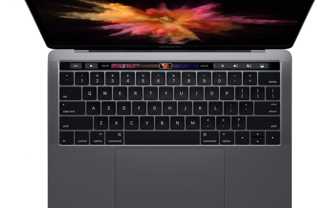
With the release of the new 13-inch and 15-inch MacBook Pros, Apple has rewarded those who have been waiting patiently for new models. They’re smaller, lighter, and faster than the previous MacBook Pros, but what really sets them apart is the new Touch Bar. What’s a Touch Bar, you ask?

It’s a thin, touch-sensitive screen above the keyboard, where the function keys used to be. The Touch Bar displays buttons, sliders, and other tools that change not only with what app you’re using, but also based on what you’re doing in that app. If you’re accustomed to using the function keys, you’ll be relieved to know that pressing the physical Fn key on the keyboard displays F1 through F12 on the Touch Bar. Most of the time, though, you’ll want to let apps customize the Touch Bar for you.

In Photos, for instance, the Touch Bar lets you scrub through your photo collection, mark photos you love, and edit photos. Once you select a photo for editing, the Touch Bar changes to provide editing tools, such as exposure and color sliders and rotation controls. In a video editing app like Final Cut Pro X, the Touch Bar can provide a timeline scrubber along with trimming tools. Plus, you’ll be able to customize the Touch Bar however you like in different apps.

mbp2

Integrated into the right edge of the Touch Bar is a Touch ID sensor, just like on an iPhone or iPad. Touch it with one finger to log in to the MacBook Pro, or with another to switch to a second account via fast user switching. Other people can use it to log in to their accounts too. The Touch ID sensor also communicates with a new Apple T1 chip in the MacBook Pro to store Apple Pay information for use in Safari when buying stuff on Web sites.

The new MacBook Pro models sport an industrial design that takes cues from the 12-inch MacBook to reduce size and weight. In fact, the new 13-inch MacBook Pro is now thinner, narrower, and less deep than the 13-inch MacBook Air and less than an ounce heavier at just over 3 pounds. The new 15-inch model weighs in at 4 pounds.

Those size and weight savings don’t come at the cost of reduced performance or battery life. Battery life is the same as the previous models at up to 10 hours, and performance is notably better, thanks to faster processors, improved graphics chips, and speedier solid-state storage. Speaking of storage, the new Macs generally start at 256 GB, with 512 GB or 1 TB SSD upgrades, and you can opt for 2 TB in the top-of-the-line 15-inch model. 8 GB of RAM is standard, but you can bump that to 16 GB.

You’ll notice that the Force Touch trackpad looks huge. That’s because it’s twice the size of the trackpad in the previous MacBook Pro models, making it easier to move around and use multi-touch gestures.

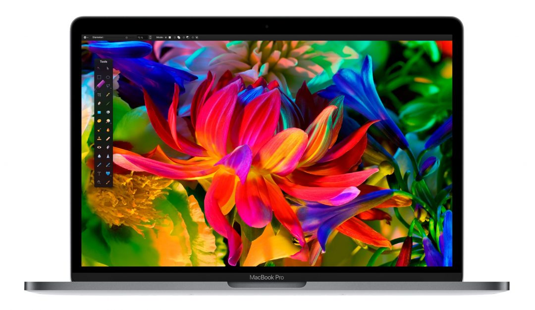
Both models feature improved screens. The resolutions remain the same as before—2560 by 1600 pixels for the 13-inch model and 2880 by 1800 for the 15-inch—but Apple says the displays are 67 percent brighter, have a 67 percent higher contrast ratio, and show 25 percent more colors, a boon to graphics professionals.

mbp3

For charging and expansion, Apple learned a lesson from the 12-inch MacBook, which has only a single USB-C port. These new machines feature four Thunderbolt 3 ports, two on each side, and you can use any port for charging, driving an external display (via an adapter for HDMI or VGA), or connecting to storage or other devices. Thunderbolt 3 uses the same physical connector as USB-C and supports older USB devices too. It boasts so much bandwidth—40 Gbps—that it can even drive two additional 5K displays or four 4K displays simultaneously!

Everything else is roughly as you might expect: 802.11ac Wi-Fi for connectivity, Bluetooth 4.2, a more responsive backlit keyboard, 3.5mm headphone jack, louder stereo speakers with greater dynamic range, three built-in microphones, and a 720p FaceTime HD camera.

Prices start at $1799 for the 13-inch model and $2399 for the 15-inch model, and you have a choice of silver or space gray colors. For those who are looking to save some money, Apple also introduced a cheaper version of the new 13-inch MacBook Pro that lacks the Touch Bar, has only two Thunderbolt ports, and uses a slower processor. The previous MacBook Pro models remain available, as do the 13-inch MacBook Air and 12-inch MacBook, so if you’re having trouble figuring out which of Apple’s laptops makes the most sense for your needs and budget, come talk to us!

Paste without Formatting on the Mac

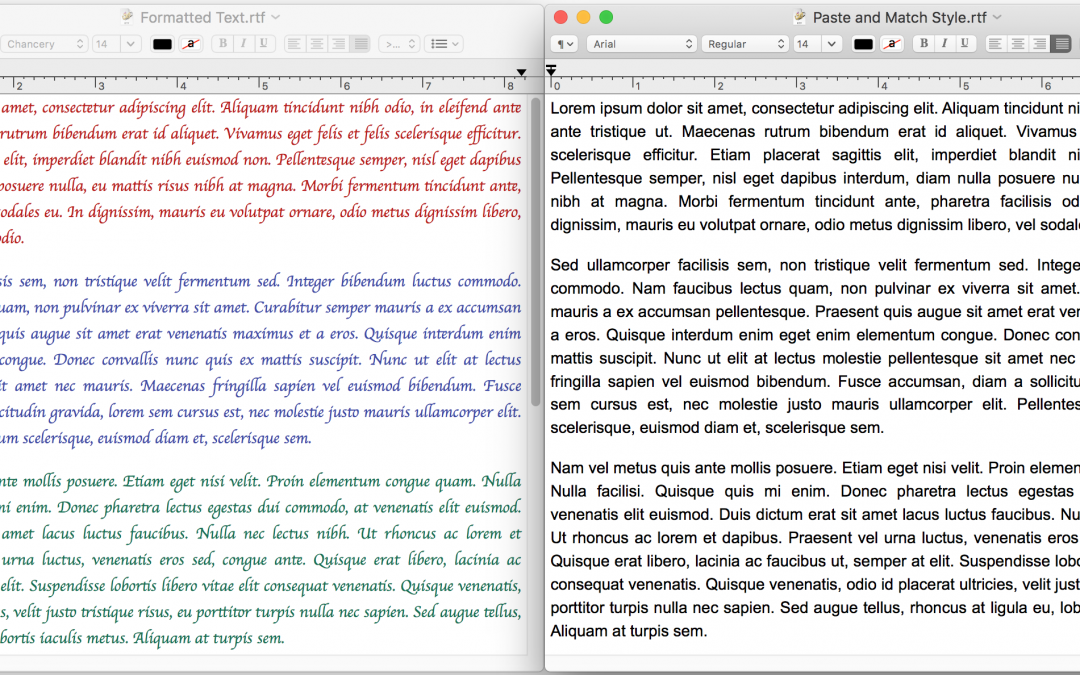
When you copy text from a Web page, PDF, or word processing document, OS X usually includes formatting, so the words you paste may be 56 point blue italic if that was what the source text looked like. That may be appropriate at times, but often you want the text to take on the (more restrained) styling of the text where you’re planning to paste it.

Rather than reformatting after pasting, in most Mac apps, try using the Edit > Paste and Match Style command (sometimes called Paste Text Only or Paste without Formatting) to paste the text such that it takes on the style of the surrounding words in the destination. Apple’s default keyboard shortcut for this is Command-Shift-Option-V, but some apps may use a different one. If you regularly need this capability in an app that doesn’t support it, consider using a clipboard utility app, like Keyboard Maestro, to make your own universal Paste Text Only hotkey.

Paste-without-keys

Find Buried Options in the iOS Settings App

iOS 10 offers about 40 top-level categories in its Settings app and seemingly innumerable options in those categories. How can you find a little-used setting, particularly since Apple sometimes moves things between categories during major iOS releases? The solution is the Settings app’s hidden Search field. To reveal it, pull down on the main settings screen (iPhone) or left sidebar (iPad). Tap the Search field, enter text describing the setting you want to find (try typing Fa to find Facebook, FaceTime, and Safari Favorites), and the results appear immediately. Tap a result to jump to it, but also notice that each result shows a path, so you can find that setting manually in the future.

iOS-9-Settings-icon-full-size

Find System Preferences Faster by Sorting Alphabetically

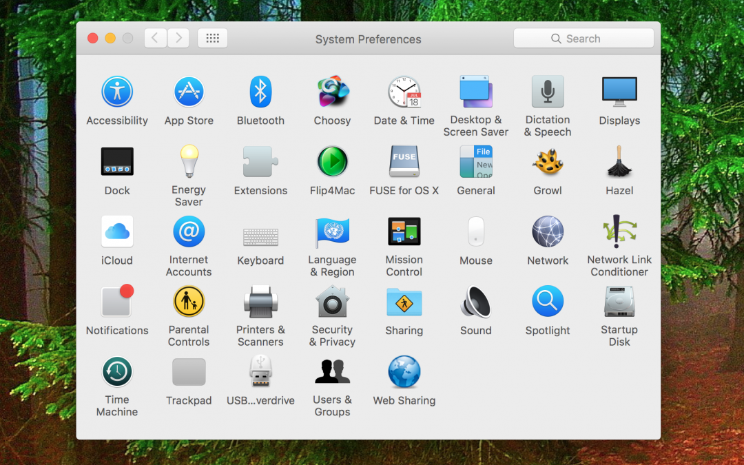
By default, System Preferences in OS X organizes its preference panes by category. However, it doesn’t label the categories, making the organization nearly inscrutable. If you have trouble finding the Accessibility preference pane, for instance, which ends up in the bottom right when sorted by category, there’s a better way. With System Preferences open, choose Organize Alphabetically from the View menu (yes, System Preferences has menus!) to arrange the icons alphabetically by name, putting Accessibility in the upper left. The preference panes are also listed alphabetically in that View menu. If even the name escapes you, use the Search field at the upper right of the System Preferences window to search for words related to the setting you’d like to adjust, like “time” to tweak how the date and time appear in the menu bar.